Grouping Fields on a Screen
Example: Grouping Fields
The following example enhances the Sales Order Preferences (SO101000) screen. To see an example of grouping fields into a group, add the Sales Orders Preferences (SO101000) screen to your customization project (as described in To Add a Screen to the Mobile Site Map (Example)), copy the code below to the Commands area of the Add: SO101000 page, and publish the project.
add screen SO101000 {
  add container "GeneralSettingsDataEntrySettings" {
    add field "DefaultSalesOrderType"
    add group "DataEntrySettings" {
      displayName = "Data Entry Settings"
      collapsable = True
      collapsed = True
      add field "DefaultTransferOrderType"
      add field "ShipmentNumberingSequence"
    }
    add recordAction "Save" {
      behavior = Save
    }
  }
}
While entering data, the user may collapse or expand a particular group of fields. You can prevent a group from being collapsed by setting the collapsable attribute of the group to False (by default, the attribute value is True). If a group is collapsible (the collapsable attribute is set to True), the collapsed attribute indicates whether a group is initially collapsed (by default, the attribute value is False).
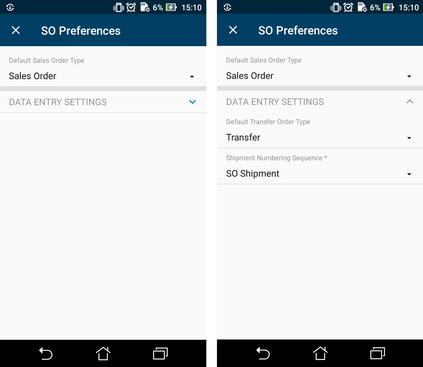
You can see the result in the mobile application in the following screenshots.
The left screenshot shows the Data Entry Settings group, which is initially collapsed. If the user clicks on the header of the group, the group is expanded, as shown in the right screenshot.