- Contents
- Index
- Search

Display results with all search words
Editing Report Components
Once a component has been added to a report using one of the Design tab toolbars, its position, size and properties can be edited in various ways.
Selecting Components
When the Select tool is enabled (by clicking the  toolbar button), report components can be selected individually or in
groups, so that they can then be re-positioned or resized. You can also
edit selected components' properties on the Report
Tree.
toolbar button), report components can be selected individually or in
groups, so that they can then be re-positioned or resized. You can also
edit selected components' properties on the Report
Tree.
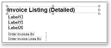
You can select or deselect a single component by clicking on it; alternatively, you can select or deselect multiple components by clicking on an empty area of the canvas and dragging a rectangle around the components you want to select - any component that is touching the rectangle will be selected. Clicking on an empty area of the canvas clears all selections.
You can use the SHIFT and CTRL keys to be make more sophisticated selections:
-
Where multiple components are layered on top of each other, holding CTRL and clicking on a component selects that component and all components underneath it.
-
Selecting multiple components that are positioned on top of a larger component can be difficult - if you try to drag a rectangle around them, you will instead select and drag the larger component. Holding CTRL and dragging a rectangle selects all components that touch the rectangle, without affecting whatever is under the pointer when you first click to start dragging.
-
Holding down SHIFT while clicking on a component adds that component to the current selection, or deselects it if it's already selected. Any other components that are already selected remain selected.
-
Holding down SHIFT and dragging a rectangle around components adds those components to the current selection, or deselects them if they're already selected. Unlike normal dragging, which selects all components in the rectangle, regardless of whether they were already selected or not, SHIFT+dragging reverses the selection of all components in the rectangle, i.e. unselected components become selected and selected components become deselected.
You can hold CTRL and SHIFT to combine both functions, e.g. CTRL+SHIFT+click selects a component and all components underneath it, adding them to the current selection.
Moving and Resizing Components
You can drag selected components to move them around the canvas. You can also drag the corner and edge controls of a single component to resize it.
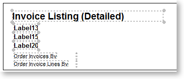
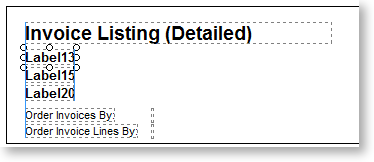
When one component is selected, the controls on its edges and corners are white circles - you can click on any of these controls and drag to resize the component:
When multiple items are selected, the controls become grey circles - you can't resize in this case, but you can move all of the components together.
You can also move and resize components using the buttons on the Size, Nudge and Align toolbars.
Note: Keyboard shortcuts are available for some of these functions: hold CTRL and use the arrow keys to nudge selected components; hold SHIFT and use the arrow keys to resize selected components.
If design guides are turned on (by selecting Design Guides from the View menu), blue guide lines appear when dragging components, so that you can align them to other components:
Right-Click Options
You can right-click on a report component to access more options around positioning and formatting them. Depending on the type of component, different options are available.
|
Option |
Description |
|
Bring to Forward |
These options control the order of components that are layered on top of each other - they behave the same way as the options on the Edit menu. |
|
Row |
These options apply to Table components - they let you set up the layout of the table. |
|
CharWrap |
This option is available for Memo and DBMemo components - if it is disabled, words will wrap to the next line if they do not fit. If it is enabled, words will be split across lines. |
|
ForceJustify |
This option is available for Memo and DBMemo components with justified text - if it is enabled, the last line of the memo will be justified. |
|
Edit |
This option is available for Rich Text and DBRichText components - it opens a Rich Text Editor window where you can edit the text of the component. |
|
Edit HTML |
This option is available for HTML components - it opens an window where you can edit the HTML text of the component. |
|
Edit Chart |
This option is available for chart components - it opens an window where you can set up the contents and appearance of the chart. |
|
Export Chart |
This option is available for chart components. For charts that are not bound to a data source, this window lets you export the chart as a bitmap image, a .WMF metafile or an .EMF enhanced metafile. |
|
KeepTogether |
This option is available for Memo and DBMemo components - it controls how the component should behave it the memo's contents do not fit on one page. If it is disabled, the contents are printed to the bottom of the available space, then continue on the next page. If it is enabled, the entire memo will be moved to the next page. |
|
Lines |
This option is available for Memo and DBMemo components - it opens a Memo Editor window where you can edit the text of the component. |
|
Clear |
This option is available for Image and DBImage components - it clears the component, removing the graphic that has been chosen for it. |
|
DirectDraw |
This option is available for Image and DBImage components - it specifies whether the image will be sent directly to the printer (enabled) or to an intermediate bitmap and then copied to the printer (disabled). If you are having difficulty getting an image to print correctly on the printer, try enabling this property. |
|
Picture |
This option is available for Image and DBImage components - it opens a window where you can select the graphic file to display. |
|
MailMerge |
This option is available for Rich Text components - if it is enabled, the component can be used for mail merges. |
|
AutoSize |
If this option is enabled, the component will resize to fit its contents. If it is disabled, it will remain at whatever size you make it - if it is too small to fit its contents, the contents will appear truncated. |
|
AutoSizeFont |
If this option is enabled, text on the component will resize to fit the size of the component. |
|
BlankWhenZero |
If this option is enabled, the component will not display zero values - if the value is zero, the component will simply appear blank. |
|
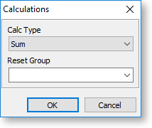
Calculations |
This option is available for Variable and DBCalc components. For Variables, it opens the Calculations window, where you can set up the calculation the component should perform. For DBCalc components, it opens a smaller window where you can specify the kind of calculation that should be performed on the data source that the component is bound to:
|
|
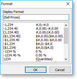
DisplayFormat |
This option is available for data components. It opens a window where you can select how the data should be displayed. The available options depend on the type of data, e.g. for currency data, there will be options for currency formats, for date/time data, there will be options for date formats, etc.
|
|
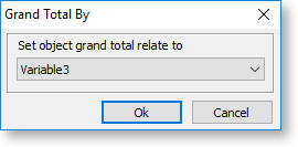
GrandTotal |
This option is available for Total Variable components - it opens a window where you can select the variable that will be totalled.
|
|
GraphicType |
For DBImage components, this option lets you specify the image file type that the component will display. |
|
LookAhead |
Enabling this option allows a component to display data that is calculated further down the report, e.g. displaying summary calculations in the Title band, or page footer calculations in the Header band. |
|
Configure |
For Barcode components, this option opens a window where you can select a barcode standard and set display options. For CrossTab components, this option opens the Configure CrossTab window where you can set up and format the CrossTab. |
|
MaintainAspectRatio |
This option is available for Image and DBImage components - if enabled, the image will retain its width-to-height ratio when it is resized. |
|
Pagination |
This option specifies how CrossTab should display when split across multiple pages. |
|
ParentHeight |
This option is available for Shape components - it resizes the shape so that it fills the entire height of the band it appears in. |
|
ParentWidth |
This option is available for Shape components - it resizes the shape so that it fills the entire width of the band it appears in. |
|
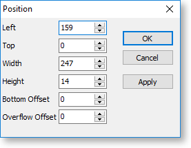
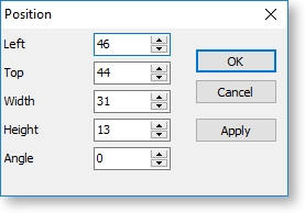
Position |
This option opens a window where you can specify the exact position of the component. The units on this window are whatever unit was selected from the Report > Units sub-menu. The available options depend on the kind of component being edited - for some components, you can specify an Angle, which allows you to rotate the component.
|
|
ReprintOnOverFlow |
This option applies to components that are set to stretch with the parent component. If this option is enabled, then when the parent component overflows onto a new page, this component will be reprinted on the new page as well. |
|
SuppressRepeatedValues |
This option is available for data-aware components. If it option is enabled, the component will not display repeated values in the dataset. |
|
ReprintOnSubsequent |
If repeated values are supressed for a component, then the component will only display a repeated value once in the entire report. Enabling this option means that the value will appear once on each page. |
|
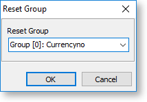
ResetGroup |
For components in a group, this option lets you set the control group for the component. If the group breaks across a page, the component will be reprinted with it.
|
|
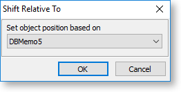
ShiftRelativeTo |
If this option is enabled, then when the component's parent band or region resizes, the component will move to stay in the same position relative to another component. When the option is first enabled, a small window opens where you can select the component that this component will shift relative to.
|
|
Stretch |
If this option is enabled, the component will resize to fit its contents. |
|
StretchWithParent |
If this option is enabled, the component will resize as its parent band or region resizes. |
|
Style |
This option is available for CrossTab components - it determines how the CrossTab's captions appear when it is split across multiple pages. |
|
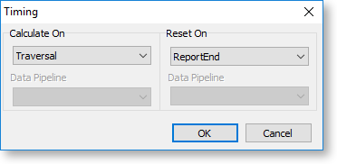
Timing |
This option is available for Variable components - it determines at what point in the report generation process the variable should be calculated.
Note: To perform calculations based on the results of other calculations, use the Calc Order window (right-click on the report band that the variable appears in and select Calc Order). |
|
Transparent |
If this option is enabled, the component will not display any foreground colour, allowing any components behind it to show through. |
|
Visible |
If this option is enabled, the component will appear on the report; if not, the component will not appear on the report, although it will still be visible on the Design tab. |
|
WordWrap |
If this option is enabled, the component's text will wrap to a new line if it does not fit horizontally. If it is disabled, text will be truncated once it reaches the edge of the component. |