- Contents
- Index
- Search

Display results with all search words
Adding Charts to a Report
Exo Clarity lets you add graphical charts to a report, which can display data from a variety of sources. Add a chart using one of the following toolbar buttons:
- The Chart button on the Standard
Components toolbar (
 ) - this adds a chart
component that is not bound to a data source.
) - this adds a chart
component that is not bound to a data source. - The DBChart button on the Data
Components toolbar (
 ) - this adds a data-aware
chart component that can be bound to a data source that has been set
up in the report.
) - this adds a data-aware
chart component that can be bound to a data source that has been set
up in the report.
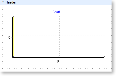
When a chart component is first added to a report, it contains no data:
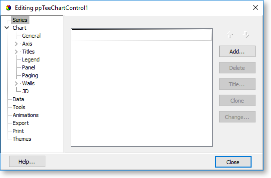
Right-click on the chart component and select Edit Chart to set up the properties of the chart. A window opens where you can set up the chart's properties:
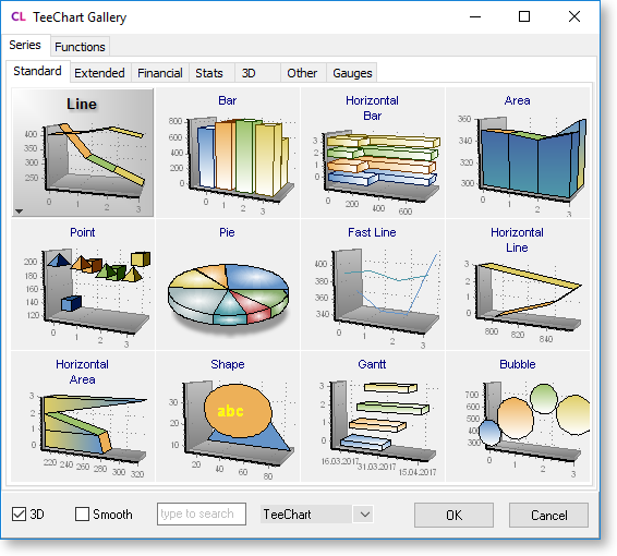
To be able to display any data on the chart, you must set up one or more data series. Click Series in the tree on the left of the window and click Add. A gallery of available chart types appears - select a type and click OK to create the chart series.
You are returned to the chart editing window, and the new series is available in the tree on the left. Select the series to edit its properties:
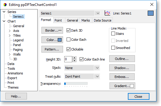
Properties for the series are divided into tabs. Most tabs control the appearance of the chart - to set up the data that appears on the chart, go to the Data Source tab:
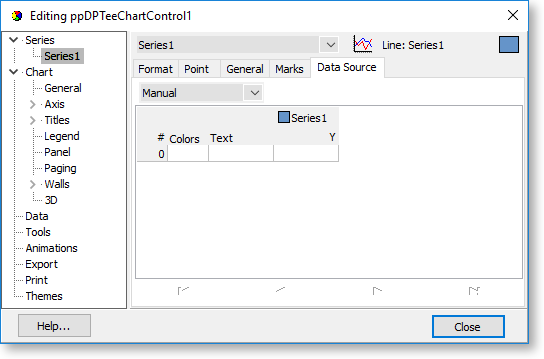
Select the data source from the dropdown at the top of this tab. The following options are available:
- Manual - Enter data to display on the chart manually.
- Random - Generate random data for the chart. This can be used for demonstration purposes.
- Series - Not currently used.
- Function - Not currently used.
- Data Pipeline - This option is available for DBChart components. It lets you select a data source from the report
- Excel - Load data for the chart form an Excel file.
In the majority of cases, you will want to select the "Data Pipeline" option. When this option is selected, the lower part of the tab contains controls that let you select and set up the data source:
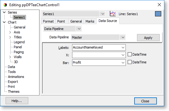
The Data Pipeline dropdown contains any data sources set up on the Data Tab, as well as other data sources that are built into the report, such as global variables and user-created report parameters. Select the data source to use, and the dropdowns below are populated with the fields, variables or parameters from the data source. Select which field should be used for which chart property. (The properties available on this tab differ depending on the kind of chart. The screenshot above shows the properties for a bar chart.)
Once the chart's data source is set up, you can use the other areas of the editing window to set up the chart's other properties.