
Form Layout: General Information
Customization projects often include the addition of UI elements and the underlying data fields to a form, and the modification of these elements. You can also change the way elements are arranged on the form: You can add tabs and sections to group similar elements and move elements to different parts of the form.
Learning Objectives
In this chapter, you will learn how to use the Element Inspector and the pages of the Customization Project Editor, including the Modern UI editor, to do the following on a form:
- View the properties of an element on the form
- Add boxes to the form
- Move elements from one part of the form to another
- Add new sections to tabs on the form and add elements to these sections
- Create tabs for a form
- Create boxes and add these boxes to the new tabs
- Add columns to the lookup tables of the boxes on a form
You will also learn how to customize the layout of a form by using the HTML editor that is available in the Customization Project Editor.
Applicable Scenarios
You modify the form layout in the following cases:
- You need to add to a form new elements, such as boxes and check boxes.
- You need to remove certain elements from the form because they are not needed.
- You need to change the position of elements on the form or group the elements into sections.
- You want to specify additional information on a data entry form, and the out-of-the-box system does not contain boxes that suit your needs.
- You want to separate the new boxes from the boxes on the existing tabs so that users can quickly find them.
- You want to filter records on the form by using certain values in the lookup table, and the default lookup table does contain the needed values.
Configuration of the Form Layout
You configure the layout of a form in two ways:
- By switching to the Form Configuration mode on this form
- By adding this form to a customization project
The Customization Project Editor provides you more tools to modify the form layout. You use this approach when you need to make changes that are not possible in the Form Configuration mode. You add a form to the customization project in either of the following ways:
- By adding the form to the list of customized screens on the Screens page of the Customization Project Editor.
- By invoking the Element Inspector dialog box for the needed element or area of the form. From the dialog box, you click Customize and select the customization project.
You then use the Screen Editor page of the Customization Project Editor to change the positions of certain elements on the form, and add elements that exist in the system but are not displayed on the form by default. You use the Customized Data Classes and Data Class pages to add to the form new elements that do not exist in the system.
For details on how to configure the form layout in the code, see Form Layout: General Information.
Use of the Element Inspector
You use the Element Inspector to start the customization of a UI element that you inspect on a particular MYOB Acumatica form. To activate the Element Inspector, you click on the form title bar. You then click the element that you want to inspect on the form. This opens the Element Properties dialog box (shown in the following screenshot).
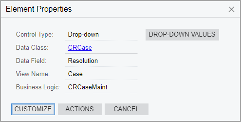
The dialog box displays various properties of the UI element that you clicked, such as its control type, data access class, data field, data view, business logic controller, actions, and drop-down control values. These properties define the visual appearance and business logic of the element. By clicking different buttons and menu commands in the Element Properties dialog box, you can view the source code of the element or start customizing it on the Screen Editor page. For more information, see UI Customization Development: General Information.
Access to the HTML Editor
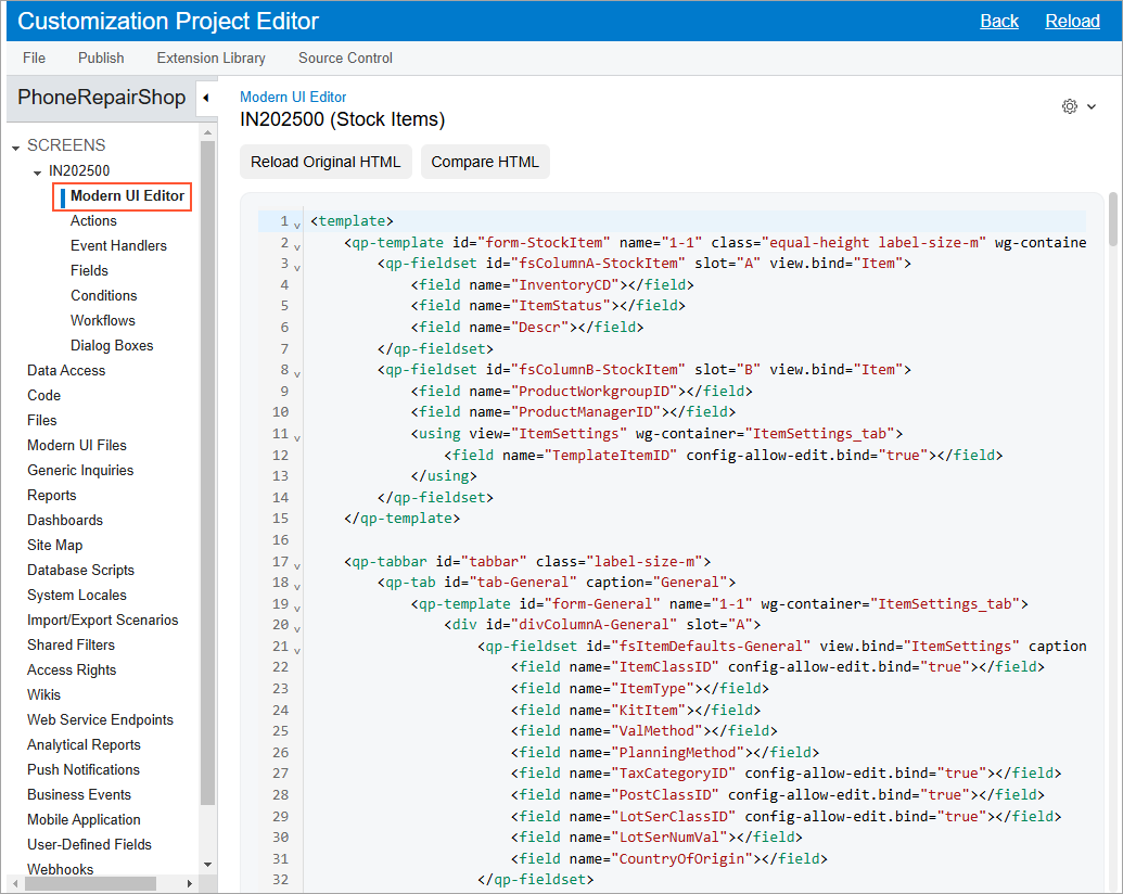
The HTML editor is available on the navigation pane of the Customization Project Editor for each form that you have added to your customization project. To access the editor, on the navigation pane, expand the Screens node. In the list of forms displayed under the expanded Screens node, expand the node that corresponds to the form for which you want to edit the HTML code, and click the Modern UI Editor node. The Modern UI Editor (AU201080) page opens with the HTML editor and displays the current HTML code for the form, as shown in the following screenshot.
Use of the HTML Editor
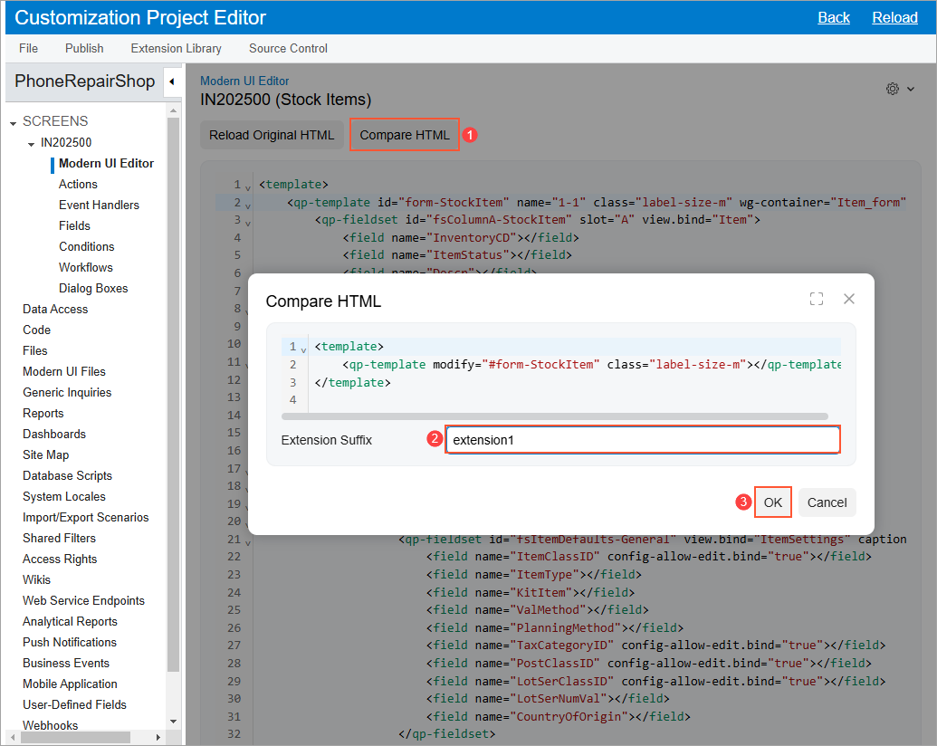
You use the editor to make the necessary modifications to the layout of the form and generate an extension file. Once you have made the necessary changes, click the Compare HTML button. The system displays a dialog box that shows the code changes that you have made. In the Extension Suffix box of the dialog box, you specify the suffix for the extension file name, and click OK. The following screenshot shows an example.
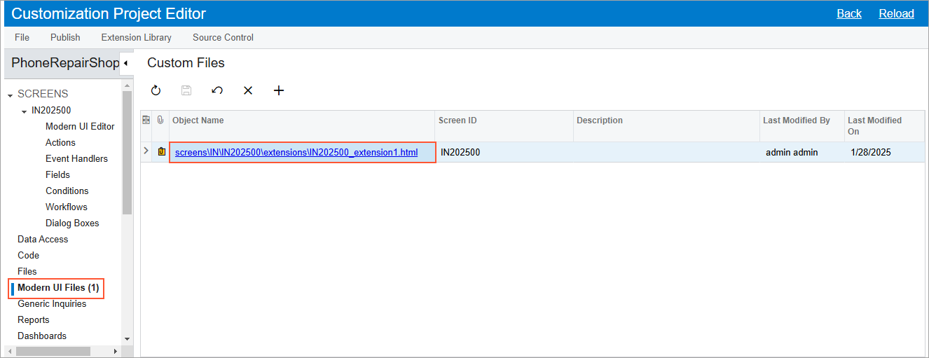
The system generates the extension file (in the specified subfolder in the FrontendSources\screen\src\customizationScreens\<Tenant Name>\screens\<FirstTwoLettersOfFormID>\<FormID>\extensions file path). It also adds this file to the Modern UI Files page under the Modern UI Files node, as shown in the following screenshot.
You then publish the customization project and validate your changes by opening the corresponding form in your instance.