
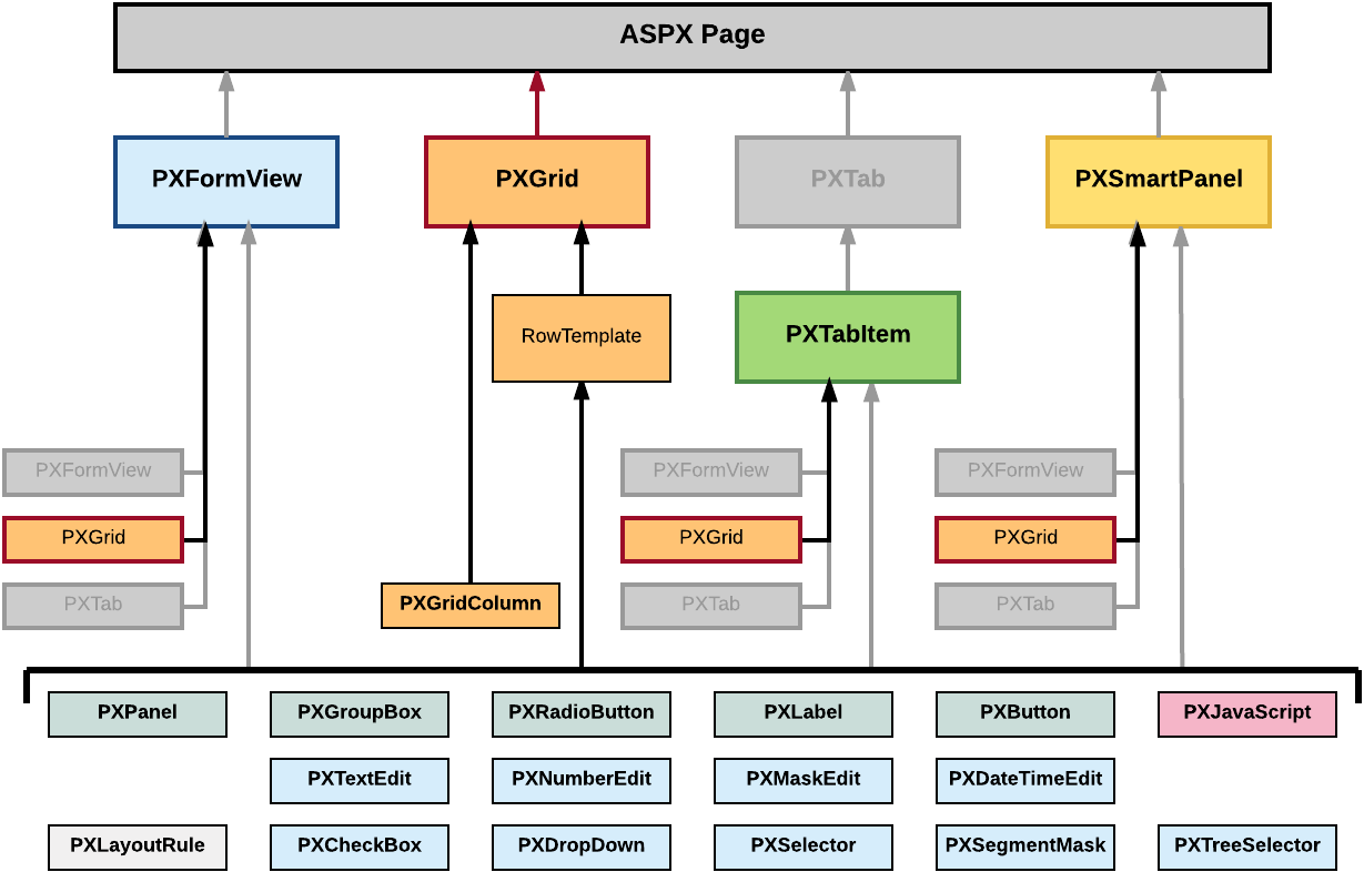
Grid Container (PXGrid)
PXGrid is a data-bound UI container control that renders a table with multiple records from its associated data source. For a single record, the object can be displayed in form view mode, which provides navigation buttons to move between records. For form view mode to be defined, PXGrid must include the RowTemplate element, which can contain controls for the record fields and layout rules for these controls.
An ASPX page can contain PXGrid as a main container that is included immediately in the page. A grid container, as the diagram below shows, can also be included in the following types of containers:
- PXFormView
- PXTabItem
- PXSmartPanel
<px:PXGrid ID="grid" ... DataSourceID="ds" ...>
  ...
    <Columns>
      ...
      <px:PXGridColumn DataField="Qty" TextAlign="Right" Width="81px" AutoCallBack="True" />
      ...
    </Columns>
    <RowTemplate>
      ...
      <px:PXNumberEdit ID="edQty" runat="server" DataField="Qty" />
      ...
    </RowTemplate>
  ...
</px:PXGrid>
Qty data field.To create a new grid in an ASPX page, follow the instructions described in To Add a Grid Container.
To delete a grid from an ASPX page, follow the instructions described in To Delete a Container.
For detailed information on working with the content of a grid container, see the following topics in this section:
- To Add a Column for a Data Field
- To Add a Control to the Form View of a Grid
- To Provide Hyperlinks for a Grid Column
The following topics may also be useful as you work with a grid container: