Adding Advanced Controls
- Adding a new tab item onto the form.
- Adding a panel onto the tab item.
- Adding an UI control onto the new panel.Note:This step is needed to make the added tab and its content visible at run time; otherwise, empty container controls aren't displayed.
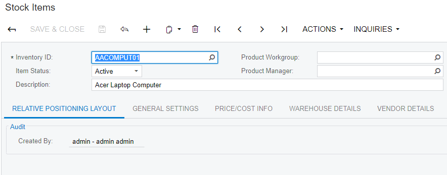
The original Stock Items (IN202500) form is shown on the screenshot below.
Adding a New Tab Item
Suppose that you need to add the Relative Positioning Layout tab item to the Stock Items (IN202500) form and set its position as the leftmost one.
To do this, perform the following actions:
- On the Stock Items (IN202500) form, click the , select the tab control, and click Customize on the Element Properties dialog box.
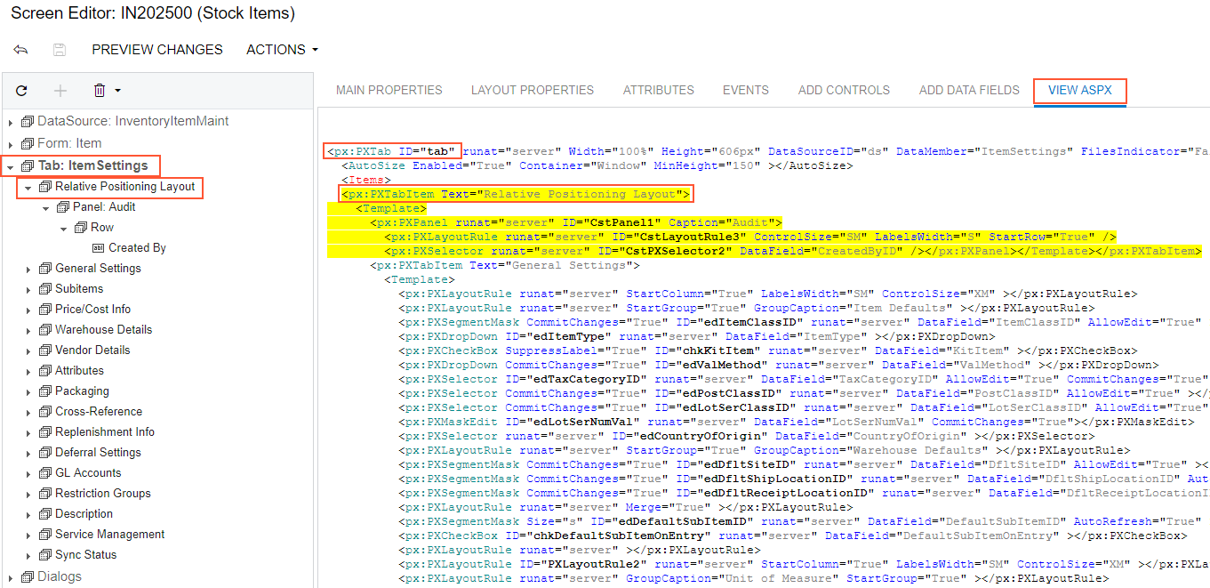
- In the Screen Editor that appears, click the Tab: ItemSettings node in the Control Tree to view all items of the tab.
- Open the Add Controls tab of the Screen Editor.
- Drag and drop the Tab Item (PXTabItem) container above the
General Settings node in the tree, as shown in the screenshot below.
Figure 2. Adding a tab item to the left position on the tab area of the Stock Items form 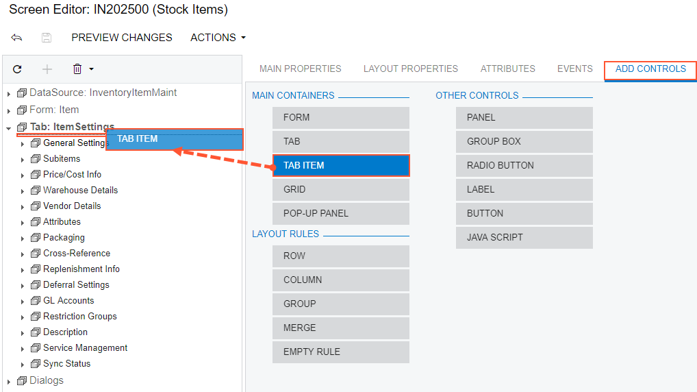
- Select the TabItem node that has been added.
- Select the Layout Properties tab of the Screen Editor.
- Select the Text property and enter Relative Positioning Layout to specify the name of the new tab.
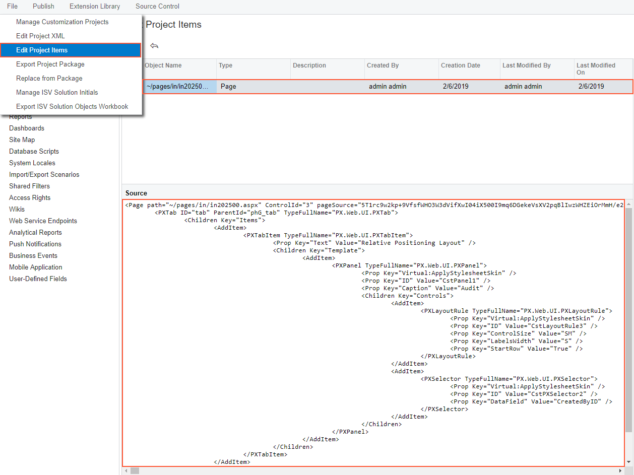
- Click Save on the toolbar of the Screen Editor to save changes to the current customization project.
Thus, to add a new tab item to a tab, you have to expand the tab node in the Control Tree of the Screen Editor, select the Add Controls tab in the editor, drag and drop the Tab Item container to place this control appropriately in relation to other items in the tab.
A container is visible on the form if the container contains a visible field control. So at the moment you cannot view the Relative Positioning Layout tab item on the Stock Items (IN202500) form even after the customization project is published or on the form preview that can be opened by clicking Preview Changes in the Screen Editor.
Adding a Panel onto the PXTabItem Container Control
Now you have to add a panel (a PXPanel control) onto the created PXTabItem control (that is, onto the new tab item), which is empty at the moment.
- Open the Add Controls tab of the Screen Editor.
- On the opened tab item, find and drag the Panel (PXPanel) control.
- Drop it into the Relative Positioning Layout tab item in the tree of controls,
as shown in the screenshot below.
Figure 3. Adding a panel onto the created PXTabItem container control 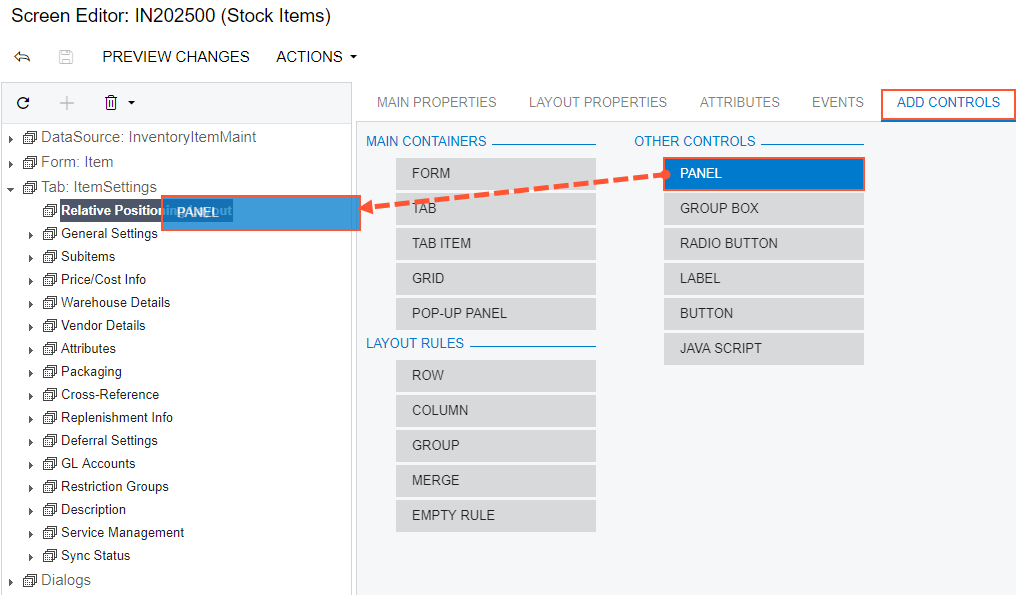
- Select the Panel: CstPanel1 node that has been added.
- Select the Layout Properties tab of the Screen Editor.
- Select the Caption property and enter Audit to specify the name of the new panel.
- Click Save on the toolbar of the Screen Editor to save changes to the current customization project.
Thus, to add a new control to a container, you have to open the Screen Editor, find the container in the Control Tree, select the Add Controls tab in the editor, find the required type of the control, and drag and drop the needed control onto the container. Then you can specify the properties of the created control.
Adding a UI Control onto the PXPanel Control
The panel is still not visible on the tab because it doesn't contain any visible controls. Add a control to the panel, as described below:
- Select the Panel: Audit node in the tree of controls.
- Open the Add Data Fields tab of the Screen Editor.
- Select the CreatedByID field in the list that at the moment displays the visible fields of the Inventory Item data access class.
- Click Create Controls on the tab toolbar (see the screenshot
below).
Figure 4. Adding a UI control to the PXPanel container control 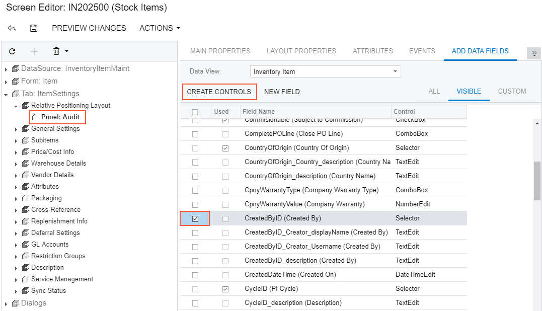
- Click the Panel: Audit node to expand and view the created control in the tree of controls.
- Open the Add Controls tab of the Screen Editor.
- Drag the Empty Rule (PXLayoutRule) control and drop it
above the Created By control in the tree, as shown in the screenshot below.
Figure 5. Adding the PXLayoutRule onto the panel 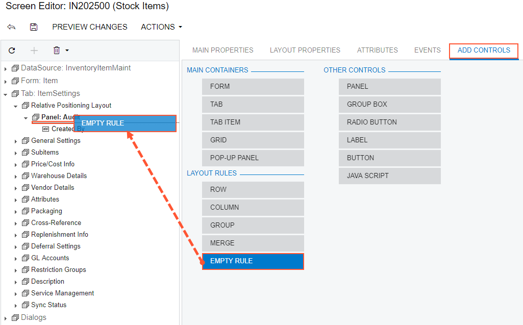
- In the Control Tree, select the Layout Rule node that has been added.
- Select the Layout Properties tab of the Screen Editor.
- Type SM as the ControlSize property value and S as the LabelWidth property value.
- Set the StartRow property to True, as shown in the
screenshot below.
Figure 6. Setting property values for the added PXLayoutRule object 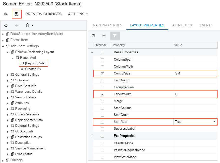
- Click Save on the toolbar of the Screen Editor to save changes to
the customization project.
After you save your changes, the Layout Rule transforms into a Control Tree node inside the Panel:Audit node according to specified properties. In this case, you see the Created By node is now inside the Row node which has the Layout Rule's properties.
Thus, to apply a layout rule to controls, you have to place the layout rule above the controls. Then you can specify the properties of the created layout rule.
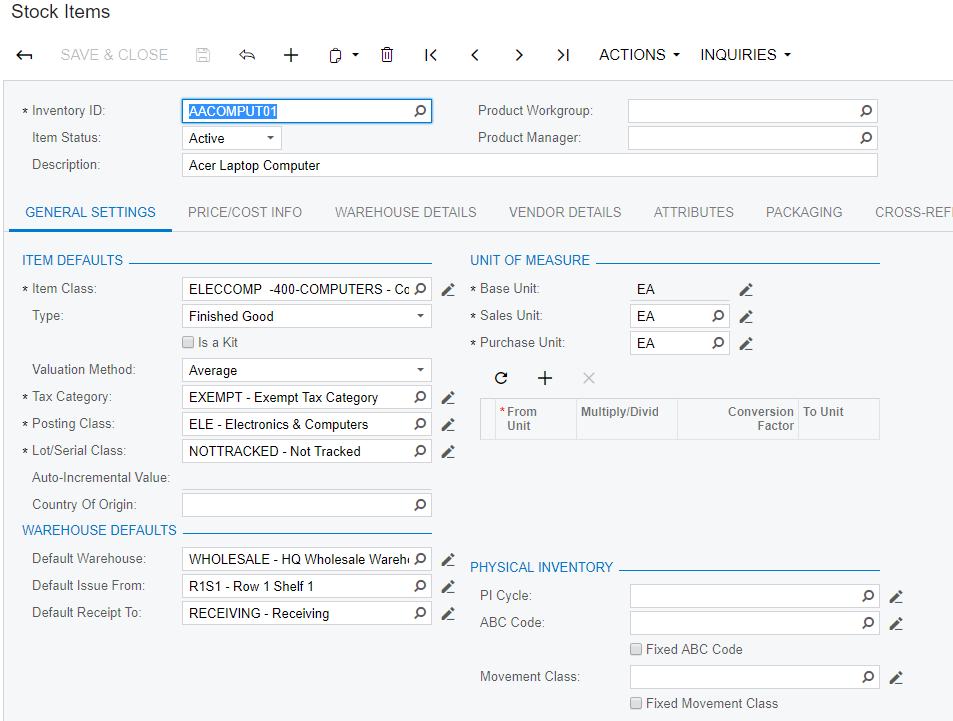
To view the changes, click Preview Changes on the toolbar or publish the project and review the changes on the Stock Items (IN202500) form after the customization has been applied.