Specific Widgets: Header Widgets
We recommend that you place widgets on a dashboard in ways that help users to grasp the information. During the design of a dashboard, you may want to organize widgets into sections and add a header to each section.
Applicable Scenario
You use a header widget to group multiple widgets under a caption (that is, a header), so that users can find the information they need more quickly.
Header Widgets
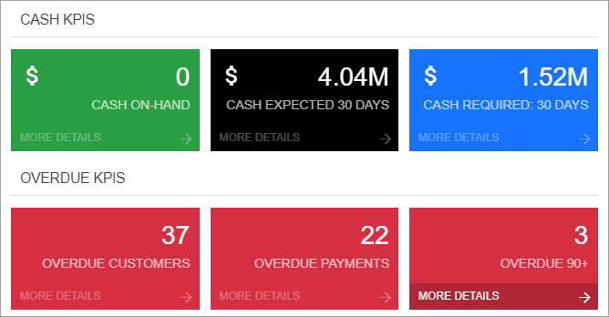
A header widget is a box with a fixed height, white background, and gray bottom border. For an example of header widgets, see the CASH KPIS and OVERDUE KPIS header widgets in the following screenshot.
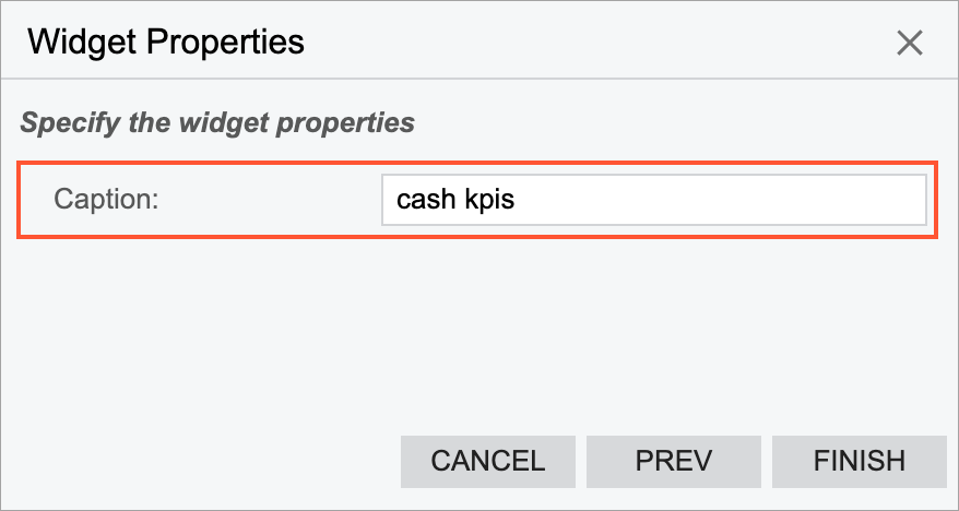
To add a header widget, you select the Header widget type in the Add Widget dialog box, which opens when you click Add a New Widget in a widget placeholder. In the Widget Properties dialog box, you enter the caption you would like to use in the Caption box (see the following screenshot). The system displays it in all capital letters on the dashboard.