Use of the StartRow and StartColumn Properties of PXLayoutRule
In this topic, you can find information how to organize controls on an ASPX page into rows
and columns.
Default Layout
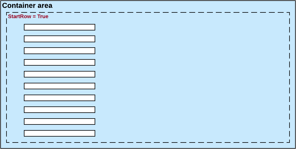
By default, the system places all the controls of a container into a column within the
first row, as shown in the diagram below. To do this, the system initially sets to
True the StartRow property value for the uppermost
PXLayoutRule component in a container.Figure 1. The default layout of controls of a container on a form The controls continue to be placed within a single column until you add a layout rule
with the StartColumn or Merge property value set to
True.
Important:
For the proper layout, the StartRow
property value must be set to True for the uppermost
PXLayoutRule component of a container.
Splitting of Controls into Columns
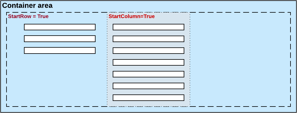
You can place controls in multiple columns within a row by adding
PXLayoutRule components with the StartColumn
property value set to True. This property creates a new column of controls within the
current layout row, as the following diagram shows.Figure 2. Creation of a new column The first control under this rule is the highest control in the column.
Splitting of Controls into Rows
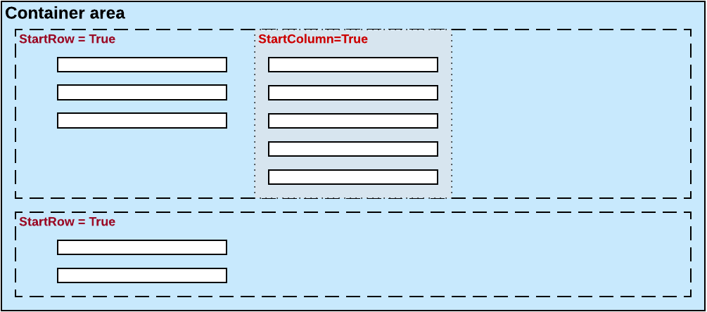
Every new PXLayoutRule component that has the
StartRow property value set to True initializes a new
independent placeholder of controls, which are placed in a single column by default. To
place controls in multiple columns within the new row, you should include in the placeholder
a new layout rule with the StartColumn property value set to True,
as shown in the following diagram.Figure 3. Creation of a new row
Sizes of Rows and Columns
Because the values of the ColumnWidth, ControlSize,
and LabelsWidth properties are never inherited from the previously
declared PXLayoutRule component, you might need to define these
properties exclusively for every new row and column.