
Data Entry Form: General Information
A data entry form is used for the input of records of a particular type. This topic provides recommendations and guidelines on organizing the layout of a data entry form.
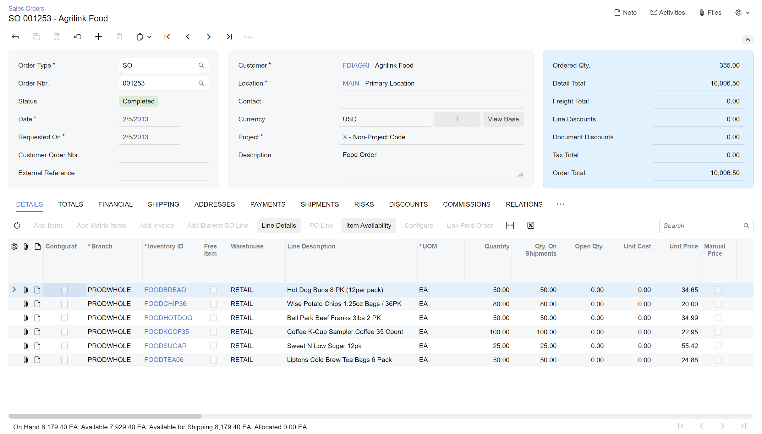
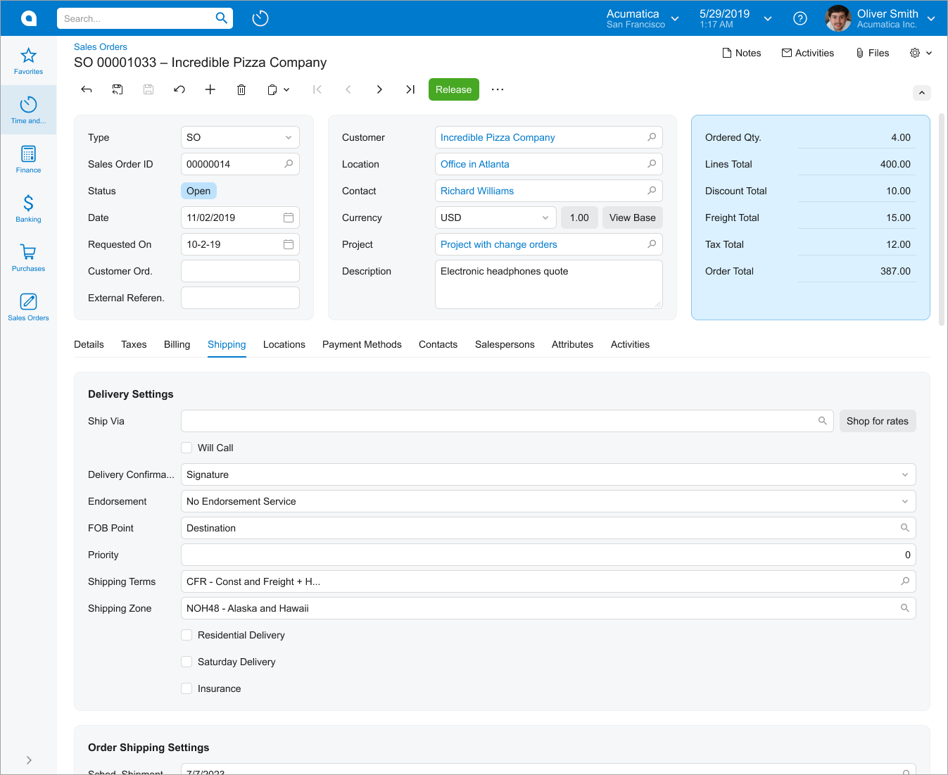
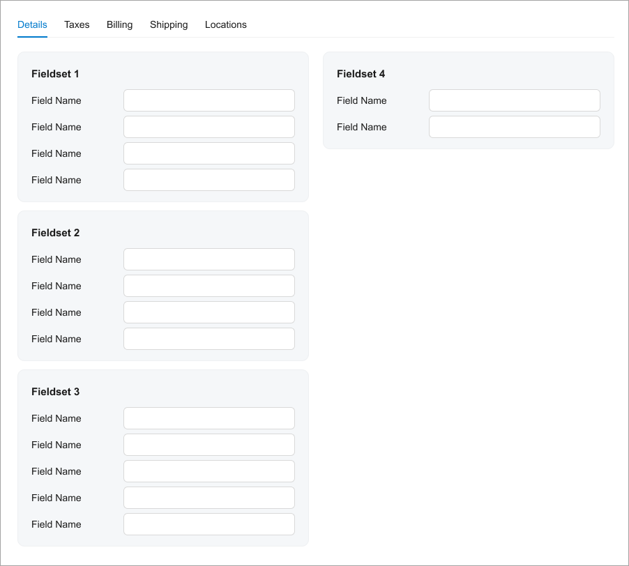
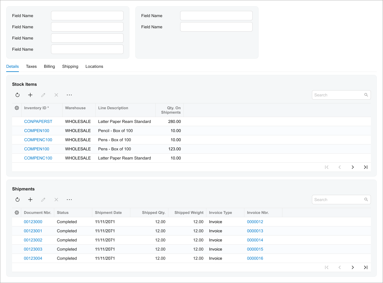
The following screenshot shows an example of a data entry form. As is true of most data entry forms, the displayed form has a Summary area and a tab area with multiple tabs. The displayed tab shows a table (generally referred to as a grid).
Learning Objectives
In this chapter, you will how to do the following when you define a data entry form:
- Organize the layout of the data entry form
- Configure the data entry form in HTML and TypeScript
Applicable Scenarios
You configure a data entry form in the following cases:
- You are migrating an existing data entry form to the Modern UI.
- You are creating a new data entry form by using the Modern UI.
Templates and Label Sizes
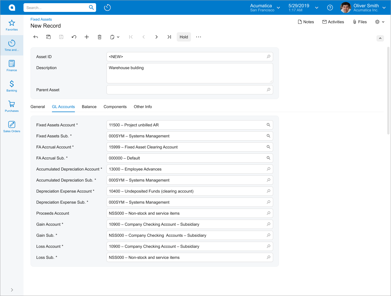
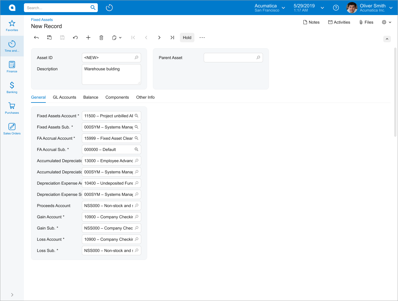
Data entry forms that display transactional data, such as Invoices and Memos (AR301000), should use three-column templates for the Summary area. You can select a particular template by the general recommendations below. You use the default label size.
Data entry forms that display profile data, such as Customers (AR303000), should use the
1-1 template. Label size should be M.
When selecting a particular template, you can also use the general recommendations that are described in Form Layout: Predefined Templates.
Recommendations for Organizing the Layout
The following table shows recommendations for organizing the layout of a data entry form.
| Correct | Incorrect |
|---|---|
|
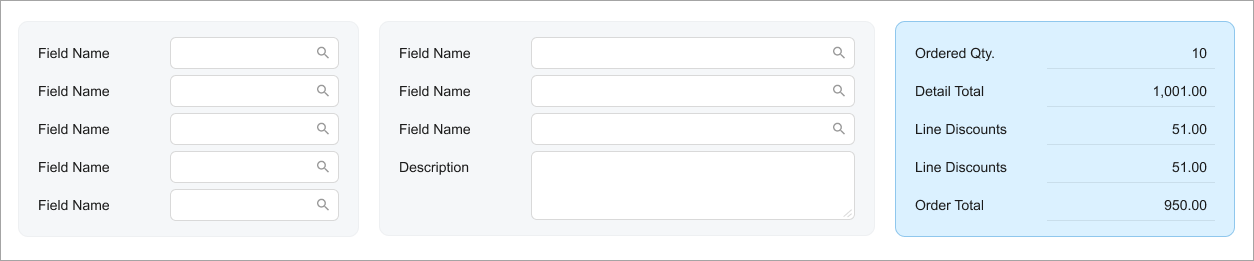
If you need to show total numbers, put them in the blue fieldset
( Do not put the blue fieldset between other fieldsets. |
|
 |
|
|
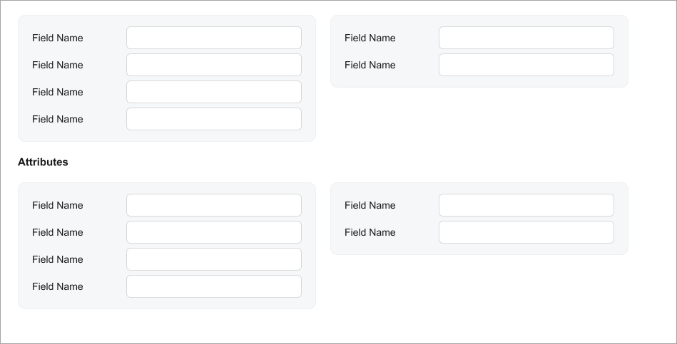
If you have multiple fieldsets with short labels and short values
in fields, put them in multiple columns and stacks by using one
of the following templates: Do not put fields with short labels and short values in fields in
the |
|
 |
|
|
Make labels with long text longer. Try to make the labels in all
fieldsets similar in length (specify
|
|
 |
|
|
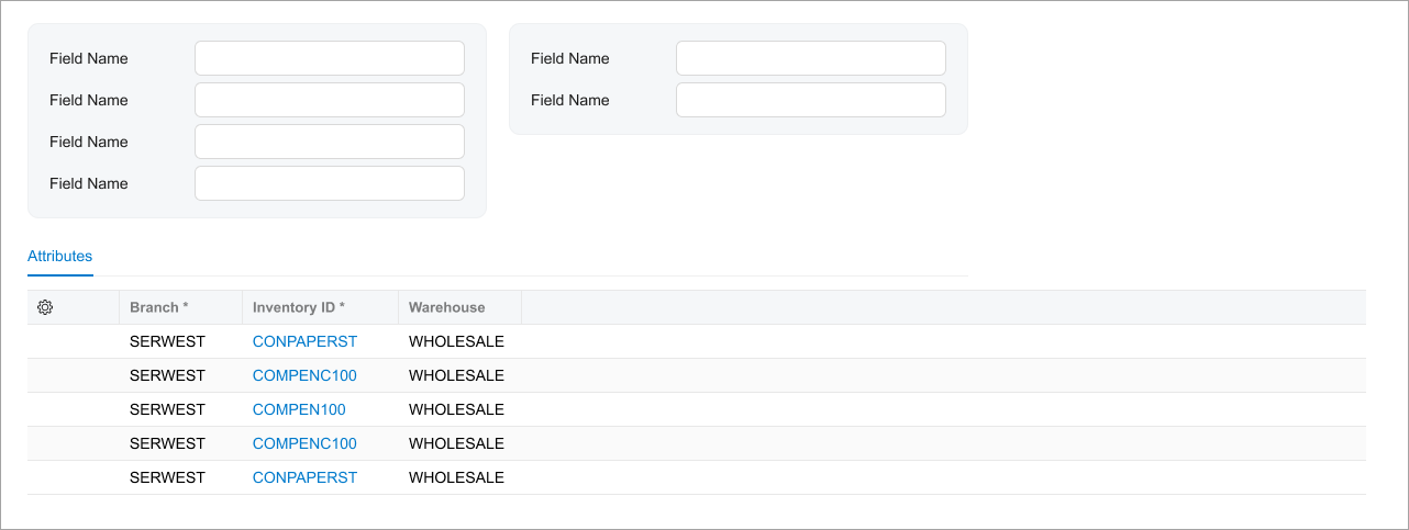
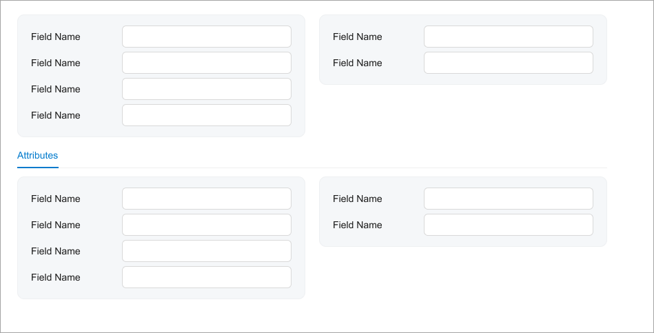
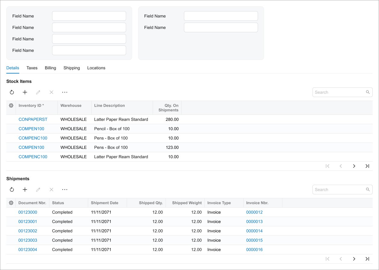
Use a caption instead of showing a single tab. For grids, add the caption as described in Table with a Title. For fieldsets in a qp-template, use the qp-caption control. |
|
  |
|
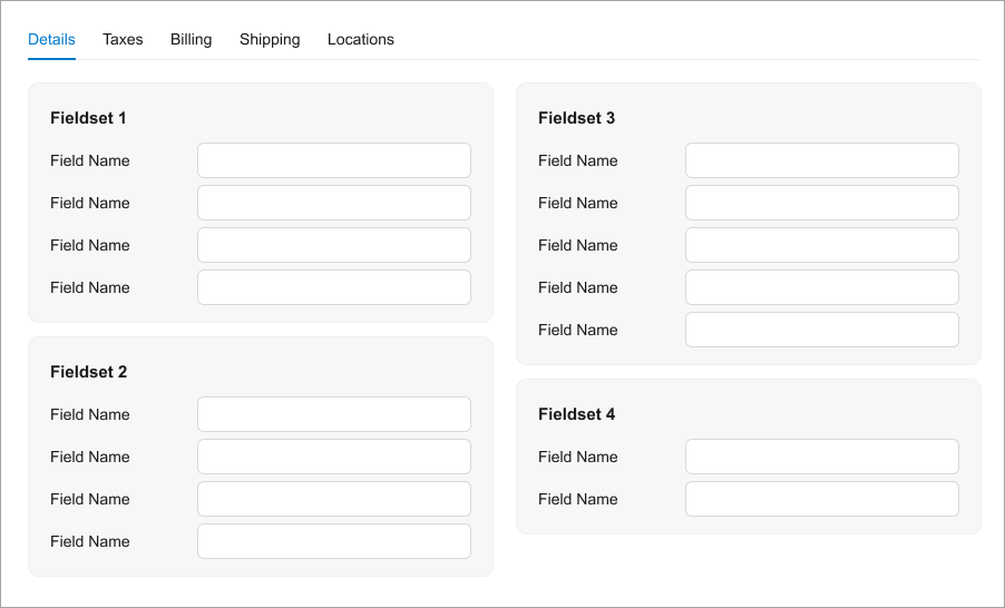
| Try to occupy slots of the template equally in order to balance the screen. | |
 |
|
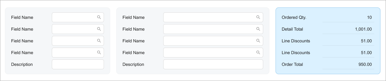
| Use the multiline Description field because the width of a single slot on the data entry form may not fit the field properly. For details, see Text Box: Multiline Text Box. | |
 |
|
| Show full-width grids without a gray background. | |
 |
|
UX and Functional Guidelines
The form design should be tailored for screens with a resolution of 1280 x 720.
The number of the data entry form should start with 30. For details, see Form and Report Numbering.