
Table (Grid): Layout Examples
In this topic, you can find examples of various layouts with tables.
Table in a Gray Section
Suppose that you need to place a table in a gray section, as shown in the following screenshot.
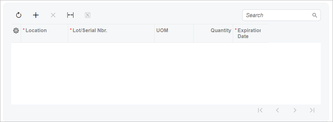
To define a table in a gray section, you specify class="framed-section"
for the qp-grid tag, as shown in the following code.
<qp-grid slot="B" id="gridSerialNumbers"
  view.bind="MasterSplits" class="framed-section">
</qp-grid>
Table with a Title
Suppose that you need to define a table with a title, as shown in the following screenshot.
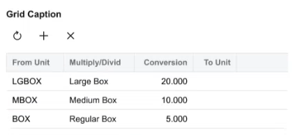
To define a table with a title, you specify the caption attribute in the qp-grid tag, as shown in the following code.
<qp-grid id="gridOrders"
  view.bind="BlanketOrderChildrenDisplayList"
  caption="Grid Caption">
</qp-grid>
Table with Elements Above It in a Gray Section
Suppose that for a table in a gray section, you need to place elements, such as boxes, above the table and inside the gray section, as shown in the following screenshot.
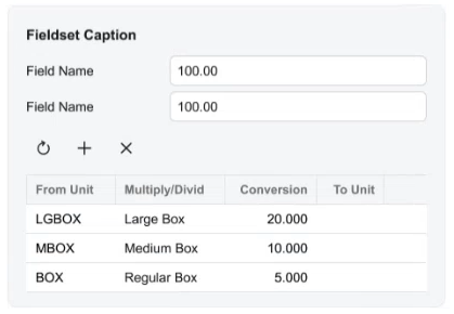
To define a table with elements above it in a gray section, you do the following in the HTML code:
- Add a qp-fieldset tag.
- Specify the caption attribute for the qp-fieldset tag.
- Put the following N + 1 field tags in the
qp-fieldset tag, where N is the number of elements you need to define
above the table:
- N fields for the elements above the table
- One field for the table with the replace-content and unbound attributes
- Put the
qp-gridtag inside the field with replace-content and unbound.
The following code implements this approach.
<qp-fieldset id="groupID" view.bind="View1" caption="Fieldset Caption">
  <field name="Field1"></field>
  <field name="Field2></field>
  <field name="FakeField" replace-content unbound>
    <qp-grid id="gridSomeGrid" view.bind="View2"></qp-grid>
  </field>
</qp-fieldset>
Table with a Title and Elements Above It in a Gray Section
Suppose that for a table in a gray section, you need to specify a table title; further suppose that you need to add elements above the table inside the gray section, as shown in the following screenshot.
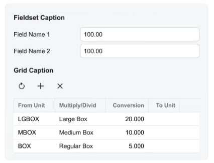
To implement this layout, you need to do the following in HTML code:
- Add a qp-fieldset tag.
- Add the title for the fieldset by specifying the caption attribute for the qp-fieldset tag.
- Put the following N + 1 field tags in the
qp-fieldset tag, where N is the number of elements you need to define
above the table:
- N fields for the elements above the table
- One field for the table with the replace-content and unbound attributes
- Put the qp-grid tag inside the field with replace-content and unbound.
- Add the title for the table by specifying the caption attribute for the qp-grid tag.
The following code implements this approach.
<qp-fieldset id="groupID" view.bind="View1" caption="Fieldset Caption">
  <field name="Field1"></field>
  <field name="Field2></field>
  <field name="FakeField" replace-content unbound>
    <qp-grid id="gridSomeGrid" view.bind="View2" caption="Grid Caption">
    </qp-grid>
  </field>
</qp-fieldset>
Table with a Fixed Height
By default, the grid is stretched over the whole width of the area. If a grid should not
occupy the whole tab or form, you specify class="fixed-height" for it, as
shown in the following example.
<qp-grid id="gridSomeGrid" view.bind="GridView" class="fixed-height">
</qp-grid>