
Dashboard Design: Widget Arrangement
Best practices in dashboard design involve more than just good metrics and well-thought-out charts. The next step is the placement of charts on a dashboard. If your dashboard is well organized, users will easily find the information they need. Poor layout forces users to think more before they grasp the key points. The general rule is that key information should be displayed first—at the top of the screen, in the upper left corner.
You should also group the charts by theme with comparable metrics placed next to each other. This way, users do not have to change gears while looking at the dashboard by, for example, jumping from sales data to marketing data, and then back to sales data.
In most situations, we recommend using no more than 10 widgets, so that users can understand the data quickly and easily. On some dashboards, however, you may want to use more widgets so that users have immediate access to a variety of different information.
Layout Selection
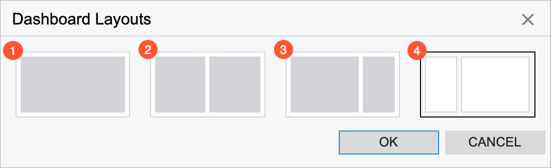
MYOB Acumatica offers four options for dashboard layout to help you organize your widgets. These options differ in the size and shape of their working areas, which are major parts of the dashboard that determine its overall appearance. You can modify dashboard layout by clicking the Edit Layout button on the title bar of the dashboard, which opens the Dashboard Layouts dialog box.
The first option (see Item 1 in the following screenshot) is a single working area in which you can arrange and resize widgets. The other three options (Items 2, 3, and 4) consist of two independent working areas of different sizes with some white space between them. You can move widgets between the working areas, but you can resize a widget only within a particular working area after you placed it in the area.
Widget Arrangement
Once you have selected a layout, you can add widgets to a working area of the dashboard. Widgets can be organized in rows or columns within the working area. The system does not allow an empty space between widgets in a row or a column within a working area. You add widgets one at a time from left to right or from top to bottom.
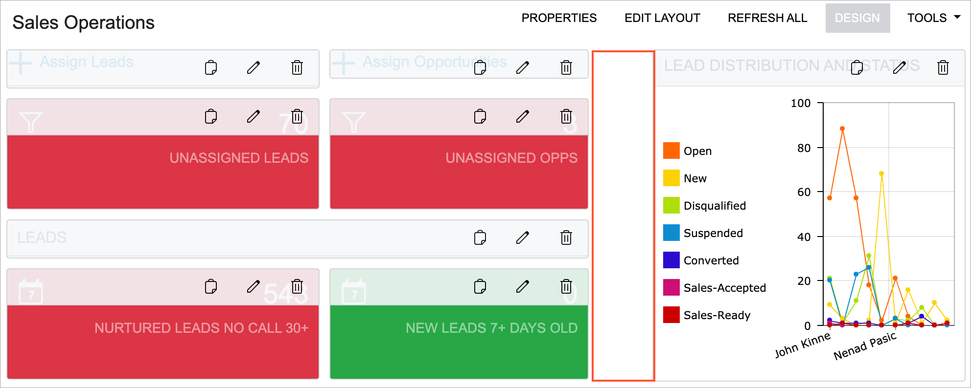
You can select a layout option that has two working areas and leave empty space between the working areas (see the following screenshot).
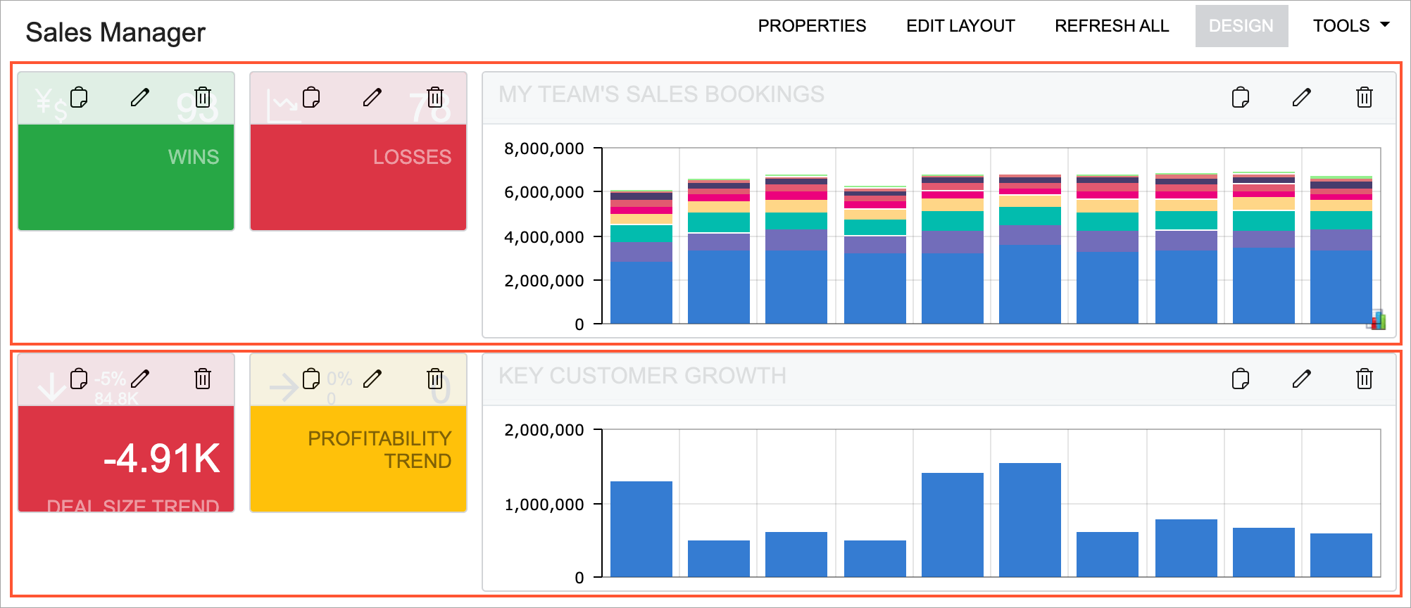
A row height is defined by the tallest widget in the row. By making some widgets shorter than the tallest widget in a row, you can visually separate the shorter widgets in the row from the widgets in the next row (see the widgets on the left of the following screenshot).
Alternatively, to visually separate groups of widgets, you can use specific widgets, such as header widgets and embedded page widgets.
A header widget can help you to group the widgets by theme. This also gives you the ability to simplify chart titles.
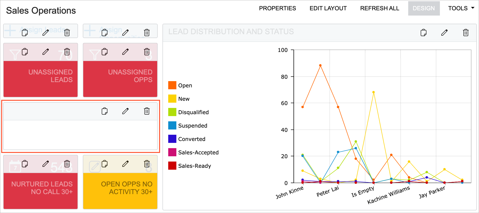
An embedded page widget can be used to display a white rectangle or square of the needed size. You can place it between other widgets in a row or between rows to add more white space to your dashboard. To create such a widget, you type about:blank instead of a URL in the widget settings and the system displays it as a white rectangle or square (see the following screenshot).