The name of the container object of the field, as it is specified in the WSDL
schema. This attribute is specified if the field from another container is used in
the container.
DisplayName
The name for the field, which by default is automatically set by the system.
However, you can change it.
ForceIsDisabled
An indicator of whether the field will be unavailable on the editing form
regardless of the server logic. By default, the field availability depends on the
server logic.
ForceIsVisible
An indicator of whether the field is visible on the editing form regardless
of the server logic. By default, the field visibility depends on the server
logic.
ForceRequired
An indicator of whether the field is mandatory and must be filled on the
screen. If its value is true, the field is mandatory. If its value is
false, the field is not mandatory. If the attribute is not specified, the
need to fill the field is determined by the data obtained from the server.
ForceType
The field type that is used by the application instead of the original field
type. The only value of this attribute is String, which is an indicator of
whether the field is visible on the editing form regardless of the server logic.
By default, the field visibility depends on the server logic.
FormPriority
The priority value that defines the position of the field on the
form.
ListDisplayFormat
The format that is used to display the field in the list. The value can be
one of the following:
Value: An indicator that the field is represented only by the field
value in the list.
CaptionValue: An indicator that the field is represented by the
caption and the value in the list.
ListPriority
The priority value that defines the position of the field in the
list.
Name
The field identifier, as found in the WSDL schema.
PickerType
(Applicable to a selector field.) The processing type of the selector field
value. The value can be one of the following:
Attached: An indicator that the selector is displayed as a pop-up
dialog.
Detached: An indicator that the selector is displayed as a separate
screen.
Searchable: An indicator that the mobile app should display the
Search button () right of
the field control. If the user enters a text fragment in the control and
clicks the button, the app sends to the MYOB Acumatica server a query to search the records, which contain the specified fragment
in the field value. After the response, the mobile app opens the selector
screen and displays the list of the field values obtained from the server. The
user uses the list to select a value for the selector control.
SelectorDisplayFormat
The selector field format that is used to display the field value. The value
can be one of the following:
Key: An indicator that the value is represented by the key field of
the selector.
Description: An indicator that the value is represented by the value
field of the selector. This is the default value of the
SelectorDisplayFormat attribute.
KeyDescription: An indicator that the value is represented by the
combination of the key and value fields of the selector.
Special
The field type that is used by the mobile app for a special purpose. The value
can be one of the following:
AllowEdit: (Applicable to a selector field.) An indicator that the
app should display the Edit button () right of
the field control. If the user clicks the button, the mobile app tries to open
the data entry form for the business entity (such as a customer or sales
order), selected in the field. The button appears if the following conditions
are met:
In the MYOB Acumatica form, the edit button is displayed for the corresponding field
control.
In the mobile app, the data field is not empty and contains an ID that
can be used to select the appropriate data record of the business
entity.
EmailAddress: An indicator that the app should treat this field as an
input box for an email address. It enables auto-complete for email addresses,
and the system displays a list of possible completions as the user types an
email address for a new email activity by using the on-screen keyboard. The
suggested completions are taken from the system database or from the device's
address book. The value is not supported in iOS apps.
EmailSend: An indicator that the app should display the Send Email
button () right of
the field control. If the user clicks the button, the mobile app forces the
system of the mobile device to create a new email message and use the field
value as the destination address for the message. In iOS. the Mail app is
opened.
PhoneCall: An indicator that the app should display the Phone Call
button () right of
the field control. If the user clicks the button, the mobile app forces the
system of the mobile device to open an application for voice calls with the
phone number specified in the field control.
GpsCoords: An indicator that the app should get a user location and
fill the field before sending to the MYOB Acumatica server the data record, which is modified on the screen. If the field value
is not defined, an action mapped on the screen cannot be executed; for
example, the user cannot save a data record, which contains an empty field
with the Special attribute set to GpsCoords.
The
location is reported as a string in the following format:
<Latitude>:<Longitude>, for instance,
65.61295166666667:-20.137938333333334.
You can forcibly hide
the field by setting the ForceIsVisible attribute to
false, so it is not shown in the user interface, or you can make
the field unavailable for editing by setting the
ForceIsDisabled attribute to true. If the
ForceIsVisible and ForceIsDisabled
attributes are not specified, then an appropriate field state will be
defined by the MYOB Acumatica server.
UrlOpen: An indicator that the app should display the Open URL button
() right of
the field control. If the user clicks the button, the mobile app forces the
system of the mobile device to launch a default browser (Safari in iOS) for
the external URL specified in the field control.
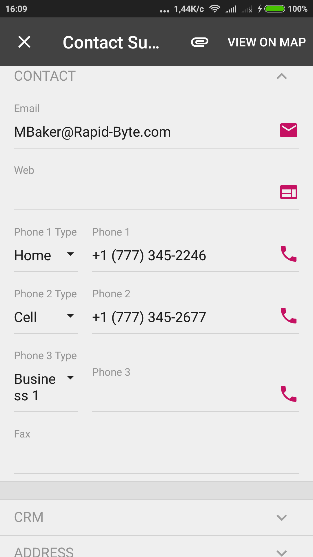
The following screenshot shows an example of using the
Special attribute for fields mapped on a screen in the
mobile app.Figure 1. Viewing the fields with the Special attribute in the
mobile app
TextType
The type of text to be used for the field value. The value can be one of the
following:
HTML: An indicator that the text can be HTML markup.
PlainSingleLine: An indicator that the text is displayed on a single
line.
PlainMultiLine: An indicator that the text is displayed on multiple
lines. The look of the input control depends on the platform.
Weight
The value that is used to set the width of the field within the UI element
line defined by the <sm:Layout> tag with the
Template attribute set to Inline. The default value is
1.
In the following example, the TotalAmount field
takes 2/3 of the total width, and the Currency field takes
1/3.

 ) right of
the field control. If the user enters a text fragment in the control and
clicks the button, the app sends to the
) right of
the field control. If the user enters a text fragment in the control and
clicks the button, the app sends to the  ) right of
the field control. If the user clicks the button, the mobile app tries to open
the data entry form for the business entity (such as a customer or sales
order), selected in the field. The button appears if the following conditions
are met:
) right of
the field control. If the user clicks the button, the mobile app tries to open
the data entry form for the business entity (such as a customer or sales
order), selected in the field. The button appears if the following conditions
are met: ) right of
the field control. If the user clicks the button, the mobile app forces the
system of the mobile device to create a new email message and use the field
value as the destination address for the message. In iOS. the Mail app is
opened.
) right of
the field control. If the user clicks the button, the mobile app forces the
system of the mobile device to create a new email message and use the field
value as the destination address for the message. In iOS. the Mail app is
opened. ) right of
the field control. If the user clicks the button, the mobile app forces the
system of the mobile device to open an application for voice calls with the
phone number specified in the field control.
) right of
the field control. If the user clicks the button, the mobile app forces the
system of the mobile device to open an application for voice calls with the
phone number specified in the field control. ) right of
the field control. If the user clicks the button, the mobile app forces the
system of the mobile device to launch a default browser (Safari in iOS) for
the external URL specified in the field control.
) right of
the field control. If the user clicks the button, the mobile app forces the
system of the mobile device to launch a default browser (Safari in iOS) for
the external URL specified in the field control.