
Form Layout: Configuring a Collapsible Section
You can configure a container or an entire template to be collapsible. When the container or the template is collapsed, only the pinned fields are displayed.
Configuring a Collapsible Section
To make a container collapsible, you should add the qp-collapsible modifier to the tag that defines the section or the template, as shown in the following code example.
<qp-template name="7-10-7" id="document_form" wg-container
  qp-collapsible class="equal-height">
As the result, the arrow button will be displayed at the top right corner of the form, as shown in the following screenshot.
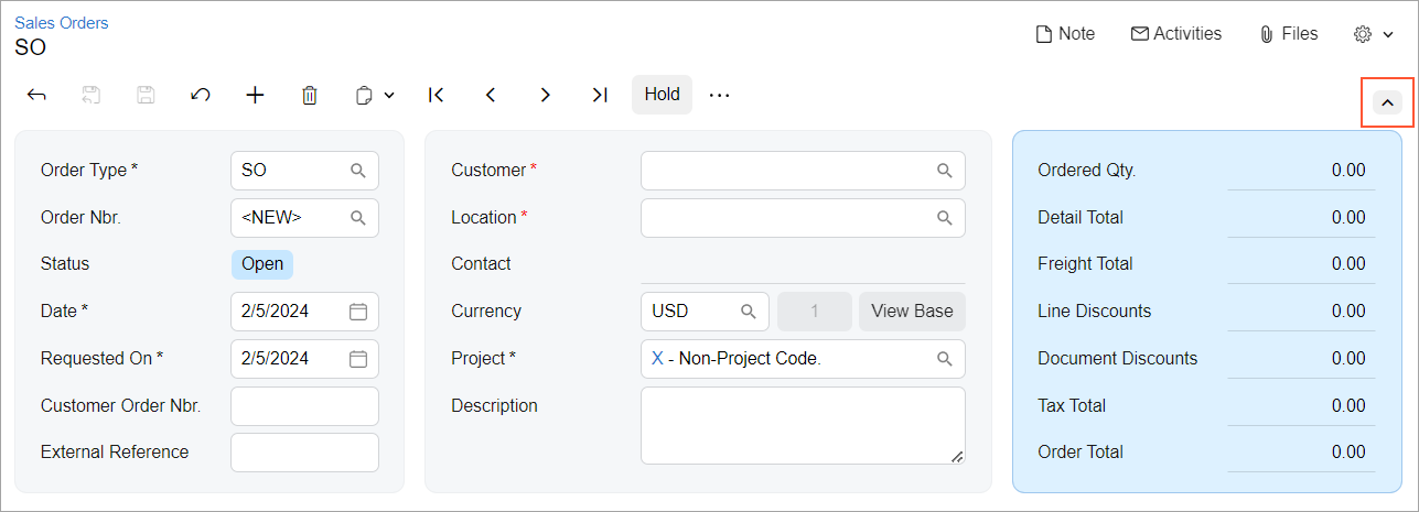
When the user clicks the button, all containers with the qp-collapsible modifier are collapsed; only the pinned fields are displayed. Sections with no pinned fields in the Summary area are displayed empty, and their height is adjusted to the height of other sections, as shown in the following screenshot.
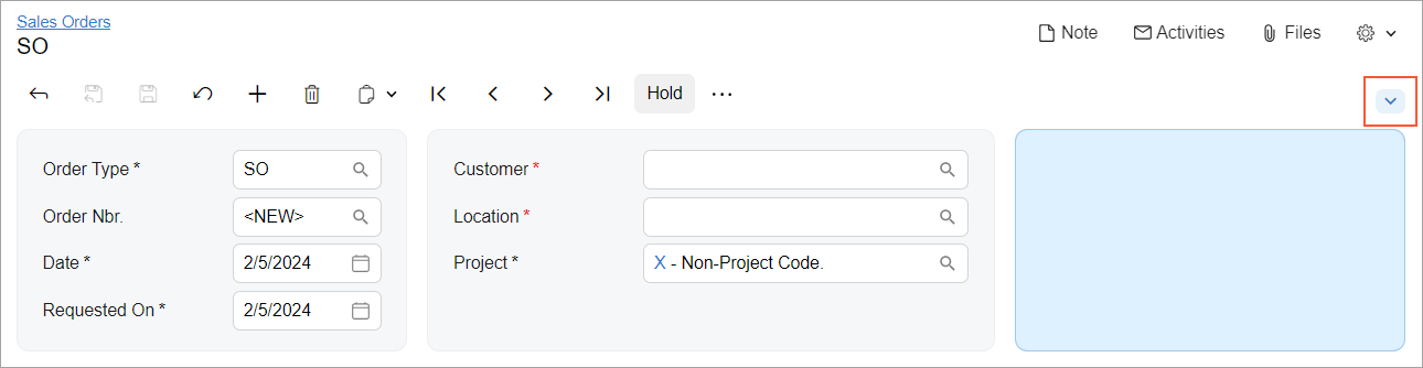
If the section is displayed elsewhere and it has no pinned fields, only the title of the section is displayed without any empty space, as shown in the following screenshot.
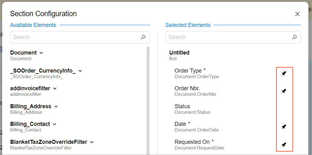
Defining Pinned Fields
By default, all required fields are pinned—that is, fields with the
[PXUIFields(Required = true)] attribute in the DAC. A user can
specify which fields are pinned on the
Screen
Configuration menu, as shown in the
following screenshot.
To manage whether the field should be pinned from code, use the pinned property of the field tag. To pin an optional field from code, specify the pinned property in the field tag, as shown in the following example.
<field name="OrderQty" pinned></field>
<field name="CuryDetailExtPriceTotal" pinned="true"></field>
To unpin the required field, specify pinned="false", as shown in the following code.
<field name="OrderDate" pinned="false"></field>