
Form Layout: CSS Classes
You can use the predefined CSS classes, which are listed below, to adjust the color settings and layout of templates. These classes are defined in the FrontendSources/screen/static/basic-layout.css file of the instance folder.
adaptive-height
You can use the adaptive-height CSS class for qp-text-box in multiline mode or for its parent control. The class causes the parent control to adapt its height to the size of the qp-text-box control.
The following example uses this class.
<qp-panel
  id="LogFileFilterRecord" caption="Log" auto-repaint="true" width="50vw">
  <qp-fieldset id="frmLockout" view.bind="LogFileFilterRecord">
    <field
      name="Text"
      class="label-size-xxs adaptive-height"
      config-type.bind="1"></field>
  </qp-fieldset>
  <footer>
    <qp-button id="btnCancel" dialog-result="Cancel" caption="Close"></qp-button>
  </footer>
</qp-panel>
align-end
The align-end CSS class causes an element to be placed on the right side of the container, such as a form.
For example, if you need a set of buttons to be placed along the right border of a form that is displayed in a pop-up panel, you need to put the buttons in a div tag and specify the align-end class for this div tag. Such a form is shown in the following screenshot.
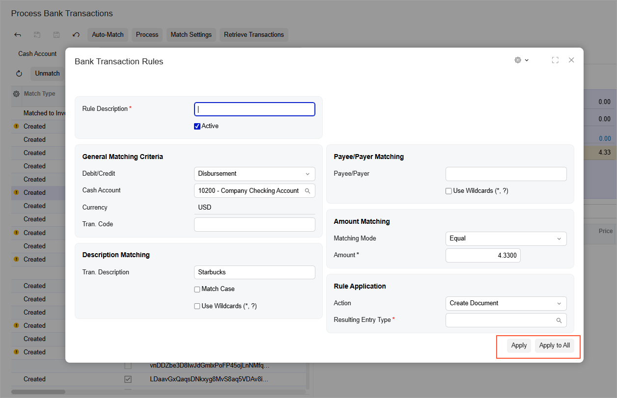
The following example implements this screenshot and uses the align-end class.
<template>
  <qp-template> ... </qp-template>
  <div class="h-stack align-end">
    <qp-button id="buttonApply" state.bind="SaveClose"></qp-button>
    <qp-button id="buttonApplyAll" state.bind="SaveAndApply"></qp-button>
  </div>
</template>col-auto
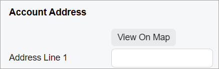
The col-auto CSS class causes an element to have its caption fully visible and does not include excessive space in any screen size, as shown for the View On Map button in the following screenshots for a narrow screen and a wide screen. That is, the width of the button is fixed for any screen size.
The following example uses this class.
<field name="AddressButtons">
  <qp-button id="btnViewOnMap" state.bind="ViewOnMap" class="col-auto">
  </qp-button>
</field>
The class can be applied to any element (however, it is designed to be used with buttons).
col-N
The col-N CSS class, where N
is a number from 1 to 12, specifies the width of a control in columns. N
defines the number of columns that the control occupies relative to the width of its parent
control. (That is, the width of the parent control is considered to be 12
columns.)
You can use these classes to organize multiple UI controls inside a field area (which are implemented with Merge in PXLayoutRule in ASPX). For examples of the organization of multiple UI controls in a field area, see Form Layout: An Element Next to Another Element.
<field name="ShipVia">
    <qp-button id="btnShopRates" state.bind="ShopRates" class="col-7">
    </qp-button>
</field>
The class can be applied to any element.
col-lg-X, col-md-X, and col-sm-X
The col-lg-X,
col-md-X, and col-sm-X CSS classes, where
X is a number from 1 to 12, specify the width of a control in columns for
different types of screens:
- For large screens: col-lg-X
- For medium screens: col-md-X
- For small screens: col-sm-X
X indicates the width in columns, where 1 is the smallest width and
12 is the full width of the parent control.
<div class="v-stack col-sm-12 col-md-6 col-lg-4"></div>The class can be applied to any element.
control-size-<SIZE>
The control-size-XXX classes limit the maximum width of a control to the specified size.
<SIZE> can have the following values:
- xxs: 40 px
- xs: 70 px
- s: 100 px
- sm: 140 px
- m: 200 px
- xm: 250 px
- l: 300 px
- xl: 350 px
- xxl: 400 px
<field class="control-size-m"...>
<qp-field class="control-size-l"...>
<qp-fieldset class="control-size-xxl"...>
The class can be applied to any element.
default-control
The default-control class indicates that the control should have focus when the form opens.
<field name="CustomerID" config-allow-edit.bind="true"
class="default-control"></field>equal-height
The equal-height class indicates that the columns in the template should be aligned in height.
The class can be applied to qp-template.
framed-section
The framed-section CSS class displays a container in a separate gray frame, as shown in the following screenshot.
<qp-grid id="gridSalesPerTran" view.bind="SalesPerTran"
  class="framed-section"></qp-grid>
The class can be applied to any container.
full-width
The full-width CSS class stretches the right side of the template to the right side of the screen, ignoring the maximum size of the form, which is 1600 px.
We recommend that you use this CSS class if you have a wide grid inside the template.
The following example uses this class.<qp-template name="7-17" id="comissions-form" class="full-width">
...
</qp-template>The class can be applied to qp-template.
h-stack
The h-stack CSS class defines the list of elements rendered horizontally.
The following example uses this class.
<div class="h-stack">
    <div class="h-stack" >
        <qp-fieldset id="first" hide-caption="true">
            ...
        </qp-fieldset>
        <qp-fieldset id="second" hide-caption="false">
            ...
        </qp-fieldset>
    </div>
    <qp-fieldset id="summary" hide-caption="false" caption="Summary" >
        ...
    </qp-fieldset>
</div>
The class can be applied to any container.
highlights-section
The highlights-section CSS class defines the style for the pane with a blue background, as shown in the following screenshot.
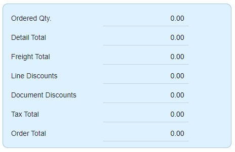
The following example uses this class.
<qp-fieldset id="totals"
  hide-caption="false"
  class="highlights-section">
  ...
</qp-fieldset>
The class can be applied to qp-fieldset.
indent-1, indent-2, and indent-3
The indent-1, indent-2, and indent-3 CSS classes define the number of indentations for the control. The number in the class name corresponds to the number of indentations.
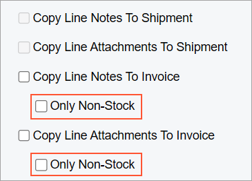
<field name="CopyLineNotesToInvoice"></field>
<field name="CopyLineNotesToInvoiceOnlyNS" class="indent-1"></field>field tag.label-size-<SIZE>
The label-size-<SIZE> CSS class specifies the width of the labels in the container.
<SIZE> can have the following values:
- xxs: 40 px
- xs: 70 px
- s: 100 px
- sm: 140 px
- m: 200 px
- xm: 250 px
- l: 300 px
- xl: 350 px
- xxl: 400 px
The class can be applied to any element.
label-size-zero
The label-size-zero class specifies that the element and its nested
elements do not have labels but should have the asterisk (*) displayed to indicate that the
value is required.
In the following code, two boxes (First Name and Last Name) are displayed in a single line. The Last Name box is required, as shown in the following screenshot.

<qp-field control-state.bind="PrimaryContactCurrent.FirstName"
    config-placeholder.bind="'First Name'">
  <qp-label slot="label" caption="Name"></qp-label>
  <qp-field control-state.bind="PrimaryContactCurrent.LastName"
    class="label-size-zero" config-placeholder.bind="'Last Name'"
    config-required="PrimaryContactCurrent.LastName.required">
  </qp-field>
</qp-field>
no-label
The no-label CSS class specifies that the element and all its nested
elements do not have labels. However, you can override this behavior in any nested element
by specifying class="label-size-<SIZE>" for the nested element.
class="no-label" with
qp-field. qp-field does not have a label by
default.If you need to hide the label part of the control but display the asterisk (*) symbol, use the label-size-zero class.
In the following code, the One field has a label of size S, the
Two field has no label, the Three field has no label,
and the Four field has a label of size M.
<qp-template name="1" id="mf" class="no-label">
  <qp-fieldset id="fs1" view.bind="MyView" class="label-size-s">
    <field name="One"></field>
    <field name="Two" class="no-label"></field>
  </qp-fieldset>
  <qp-fieldset id="fs2" view.bind="MyView">
    <field name="Three"></field>
    <field name="Four" class="label-size-m"></field>
  </qp-fieldset>
</qp-template>
The class can be applied to any element.
no-stretch
The no-stretch CSS class prevents the element from being stretched over the height of the whole MYOB Acumatica form or the area of a form, such as a tab.
<div class="v-stack">
    <div id="Filter_form" wg-container>
            ...
    </div>
    <qp-grid id="grid" view.bind="EnqResult"
      class="no-stretch">
    </qp-grid>
</div>
The class can be applied to any container.
stretch
The stretch CSS class stretches the element over the height of the container to which the element belongs. For example, the element can be stretched to the height of the whole MYOB Acumatica form or the area of a form, such as a tab.
The class is applied by default to
qp-grid and qp-tabbar.
<qp-rich-text-editor id="edDescription" class="stretch"
  state.bind="Case.Description">
</qp-rich-text-editor>
The class can be applied to any element.
transparent-section
The transparent-section CSS class defines the style of the pane with the transparent background.
We recommend that you use transparency only for fieldsets with a maximum of two rows of controls.
The following screenshot shows an element in a transparent fieldset.
The following screenshot shows a selected check box in a transparent fieldset.
<qp-template name="17-17-14" id="byBookFilterForm">
  <qp-fieldset slot="A" id="deprBookFilterForm" view.bind="deprbookfilter"
    class="transparent-section">
    <field name="BookID"></field>
  </qp-fieldset>
</qp-template>
The class can be applied to qp-fieldset
.
v-stack
The v-stack CSS class defines the list of elements rendered vertically.
The elements are rendered vertically by default; therefore, in most cases, there is no need to use this class.
The following example uses this class.
<div class="v-stack">
    <div id="Filter_form" wg-container>
            ...
    </div>
    <qp-grid id="grid" view.bind="EnqResult">
    </qp-grid>
</div>
The class can be applied to any container.