
Table (Grid): Reference Information
In the tables of this topic, you can find reference information about tables in the UI, which are also called grids.
Conversion from ASPX to HTML and TypeScript
The following tables will help you to convert ASPX elements that are related to tables to HTML or TypeScript elements.
| ASPX | HTML or TypeScript |
|---|---|
ActionBar |
To specify the toolbar buttons for the grid, define actions in the view class
of the grid in TypeScript, as shown in the following
code. |
DefaultAction |
Use the defaultAction property of the
gridConfig decorator, as shown in the following code. The
property specifies the action that is executed when a user double-clicks a record in
the table. |
| ASPX | HTML or TypeScript |
|---|---|
AutoCallback |
Use the autoRepaint property in the
gridConfig decorator, as shown in the following code. The
property refreshes the specified data view depending on the record selected in the
table. |
| ASPX | HTML or TypeScript |
|---|---|
AllowAddNew |
Use the allowInsert property of the
gridConfig decorator. If the value is true, this
property indicates that a user can insert new records directly in the table. The
following code uses this property. |
AllowDelete |
Use the allowDelete property of the
gridConfig decorator. If the value is true, this
property indicates that a user can delete records directly in the table. The
following code uses this property. |
AllowRowSelect |
Use the allowRowSelect property of the
gridConfig decorator. If the value is true, this
property indicates that a user can select a row in the table. The following example
uses this property. |
AllowUpdate |
Use the allowUpdate property of the
gridConfig decorator. If the value is true, this
property indicates that a user can update records in the table. The following code
uses this property. |
InitNewRow |
Use the initNewRow property of the
gridConfig decorator. If the value is true, this
property indicates that the webpage should perform a server callback upon the
insertion of a new row. Normally, when a user clicks the Add
Row button on a table toolbar, the new empty row is created only on
the webpage, and the data is not sent to the application server. This means that
the C# code with all event handlers is not executed. For the data to be sent to
the server, you need to specify The following
code uses this property. |
| ASPX | HTML or TypeScript |
|---|---|
PXGrid |
Is replaced by qp-grid in HTML. To define a table, you need
to instantiate a view class with the gridConfig decorator in
TypeScript and add a qp-grid tag in HTML, as shown in the
following code fragments. |
AdjustPageSize |
Use the adjustPageSize property in the
gridConfig decorator, as shown in the following example. If the
value is true, this property makes the table show only one page of rows,
without the vertical scrollbar. The following code uses this
property. |
AllowFilter |
Use the allowStoredFilters in the
gridConfig decorator, as shown in the following code. If the
value is true, the system adds the Search box for the table. The following
code uses this property. |
AllowPaging |
Use the pagerMode property in the
gridConfig decorator, as shown in the following code. The
property defines whether pages should be displayed for the table. The property can
have one of the following values, which are defined by the
GridPagerMode enum:
|
AutoAdjustColumns |
Use the autoAdjustColumns property in the
gridConfig decorator. If the value is true, the property
makes the system adjust the column width automatically. The following code uses this
property. |
AutoGenerateColumns |
Use the generateColumns property of the gridConfig decorator. The property defines the mode of column generation for the table. You can use one of the following modes, which are defined in the GridColumnGeneration enum:
|
AutoSaveLayout |
Use the autoSaveLayout property of the
gridConfig decorator. If the value is true, the property
makes the system save the layout of the table after each column is resized. The
following code uses this property. |
BatchUpdate |
Use the batchUpdate property of the
gridConfig decorator, as shown in the following code. If a
table contains editable fields that depend on each other, the
BatchUpdate property should be
false. |
Caption |
Use the caption attribute of the qp-grid
control in HTML. The attribute defines a title for the table. When the table is
hidden, the title specified in the caption attribute is hidden
too.Note: The following
code specifies a title for the table.Do not use the qp-caption or
qp-label tags to specify a table title. |
EditPageUrl |
Use the gridDataUrl property in the gridConfig decorator. You can use this property to change the standard API for the retrieval of the table data. |
FastFilterFields |
Use allowFastFilter in the columnConfig decorator for the needed columns or fastFilterByAllFields in the gridConfig decorator. Take into account the following considerations:
|
FastFilterId |
Use the fastFilterId property in the
gridConfig decorator. The property specifies the ID of the
field whose value is used as the fast filter for the table. The following code uses
this property. |
FilesIndicator |
Use the suppressNoteFiles property in the
gridConfig decorator. This property hides the Note and File
columns from the table. The following code uses this
property. |
ID |
Use the id attribute of the qp-grid
control in HTML. The attribute specifies the ID of the control, as shown in the
following code. |
NoteIndicator |
Use the suppressNoteFiles property in the
gridConfig decorator. This property hides the Note and File
columns from the table. The following code uses this
property. |
PageSize |
Use the pageSize property in the
gridConfig decorator. This property specifies the maximum
number of records on a page if the table is displayed on multiple pages. The
following code uses this property. |
PreserveSortsAndFilters |
Use the preserveSortsAndFilters property in the
gridConfig decorator. If the value is true, this
property specifies that the current filter and sorted columns should be stored in
the session. By default, the value is false. The following code uses this property. |
SkinID |
Use the preset property of the gridConfig
decorator. The property specifies a set of settings that define the appearance of
the table. The following values, which are defined by the
GridPreset enum, are available:
For more information about presets, see Form Layout: Grid Presets. The following code uses
this property. |
StatusField |
Use the statusField property of the
gridConfig decorator. The property specifies the name of the
column that is displayed in the footer of the table. The following code uses this
property. |
SyncPosition |
Use the syncPosition property of the gridConfig decorator. If the value is true, the property specifies that the Current record must be synchronized with the record selected in the table. Tip: The following code uses this property.If a form contains a table and the form toolbar includes an action to process a single record that is selected in the table, the action delegate method must have a reference to the selected record in the cache. To use the Current property of a PXCache object to access the record selected in a table, the Current property must be synchronized with the record selected in the grid. To force the system to provide this synchronization, you have to set the syncPosition property of the gridConfig decorator to true. |
TabIndex |
Use the tabIndex property of the
gridConfig decorator. The property specifies the index of the
table during the TAB navigation. The following code uses this
property. |
| ASPX | HTML or TypeScript |
|---|---|
PXGridColumn |
Define columns in the view class of the table in TypeScript, as shown in the
following example. |
AllowCheckAll |
Use the allowCheckAll property in the
columnConfig decorator, as shown in the code below. If the
value is true, the system adds a check box in the header of the column, which
gives the user the ability to select all check boxes in the column for the
page. |
AllowFilter |
Use the allowFilter property in the
columnConfig decorator, as the following code shows. If the
value is true, the system adds column filtering in the header of the
column. |
AllowFocus |
Use the allowFocus property in the
columnConfig decorator, as the following code shows. If the
value is true, the system places the cursor in the column when a new record
is added to the table. |
AllowNull |
Use the allowNull property in the
gridConfig decorator, as shown below. If the value is
false, the system prevents the cell value from being
cleared. |
AllowShowHide |
Use the allowShowHide property in the
columnConfig decorator. The property manages a user's ability
to show or hide the column in the table. (The user can show or hide the column in
the Column Configuration dialog box.) The property can have one of the following values, which are defined by the GridColumnShowHideMode enum:
The following code shows an example of the use of this property. |
AllowSort |
Use the AllowSort property of the
columnConfig decorator, as shown in the following code. If the
value is false, the property turns off the capability for a user to sort the
values in the column. |
AllowUpdate |
Use the allowUpdate property of the
columnConfig decorator. If the value is true, the
property indicates that a user can update the value in the column. The following
example uses this property. |
CommitChanges |
Use PXFieldOptions.CommitChanges in TypeScript, as shown in
the following code. The option indicates that the webpage commits the changes in the
column to the server. |
DataField |
Define data field for the column in the view class of the table in TypeScript,
as shown in the following
code. |
Decimals |
Use the decimals property of the
columnConfig decorator. The property defines the number of
decimal values to be displayed in the column cells. The following example uses this
property. |
DisplayMode |
Use the displayMode property in the
columnConfig decorator, as shown in the code below. The
property specifies the display mode for each cell of the column. The display mode,
which is defined by the GridColumnDisplayMode enum, can be one of
the following:
|
ForceExport |
Use the suppressExport property of the
columnConfig decorator. If the value is true, the
property specifies that the column is not included in the results of the export of
the table. The following code uses this property. |
Key |
Use the key property of the columnConfig
decorator. The property specifies the key for unbound columns, such as Notes and
Files. The following code uses this property. |
LinkCommand |
Use the linkCommand decorator for the column field in
TypeScript, as shown in the following example. The decorator specifies the action
that is executed when a user clicks the link in the column
cell. |
MaxLength |
Use the maxLength property in the
columnConfig decorator. The property specifies the maximum
length of the string in the column. The following code uses this
property. |
NullText |
Use the nullText property in the
columnConfig decorator. The property specifies the value that
is displayed if the column value is NULL. The following code uses this
property. |
TextAlign |
Use the textAlign property in the columnConfig decorator. The property specifies the alignment of the values in the column. You can use one of the following values, which are defined in the TextAlign enum:
|
TextField |
Use the textField property in the
columnConfig decorator. The property specifies explicitly which
field should be displayed in the column selector control. The following code uses
this property. |
TimeMode |
Use the timeMode property in the
columnConfig decorator. If the value is true, the
property turns on the time mode for the date and time column. The following code
uses this property. |
Type |
Use the type property in the columnConfig decorator. The property specifies the type of the column content. You can use one of the following values, which are defined by the GridColumnType enum:
The following code uses this property. |
Visible |
Use PXFieldOptions.Hidden in TypeScript, as shown in the following code. In particular cases, you can use the visible property of the columnConfig decorator, as shown in the following code. Columns with |
Width |
Use the width property in the
columnConfig decorator. The property specifies the width of the
column. The width is defined in pixels. The following code uses this
property. |
| ASPX | HTML or TypeScript |
|---|---|
DataMember |
|
| ASPX | HTML or TypeScript |
|---|---|
PXGridWithPreview |
To define a grid with a preview text editor below, use the qp-splitter tag, as shown in the following example. |
| ASPX Control | Properties |
|---|---|
CallbackCommands |
All properties |
ClientEvents |
All properties |
OnChangeCommand |
All properties |
Mode
|
|
PXGrid |
|
qp-grid Control
The following table lists the properties of the qp-grid control, which represents a table in HTML.
| Property | Description |
|---|---|
| caption | Defines a title for the table. When the table is hidden, the title specified in
the caption attribute is hidden too.Note: The following code specifies a title for the
table.Do not use the
qp-caption or qp-label tags to specify a
table title. |
| id | Specifies the ID of the control, as shown in the following
code. |
| view.bind | Specifies the data view that provides fields for the table. The data view must
be defined in the TS file. You must use the bind command with this
attribute, as the following code
shows. |
gridConfig Decorator
The following table lists the properties of the TypeScript gridConfig decorator, which is used for the configuration of a table.
| Property | Description |
|---|---|
| actionsConfig | Handles the state and appearance of an action. The following code shows examples of
the use of this
property. |
| adjustPageSize | Makes the table (if the value is true) show only one page of rows,
without the vertical scrollbar. You assign this property so that the system can
build the select top(x) SQL query for the table. The following
example uses this property. |
| allowDelete | If the value is true, indicates that a user can delete records directly
in the table. The following example uses this
property. |
| allowFilter | If the value is false, prohibits any filtering in the table. The
following example uses this property. |
| allowImport | If the value is true, indicates that the Load Records from
File button is available on the table toolbar. The following example
uses this property. |
| allowInsert | If the value is true, indicates that a user can insert new records
directly in the table. The following example uses this
property. |
| allowRowSelect | If the value is true, indicates that a user can select a row in the
table. The following example uses this property. |
| allowSkipTabs | If the value is true, indicates that a user can select the columns that
are skipped during navigation with the Tab key. The following example uses this
property. |
| allowSort | If the value is false, prohibits any sorting in the table columns. The
following example uses this property. |
| allowStoredFilters | If the value is true, adds the Search box for the table. The following
example uses this property. |
| allowUpdate | If the value is true, indicates that a user can update records in the
table. The following example uses this property. |
| autoRepaint | Refreshes the specified data view depending on the record selected in the table. The
following example uses this property. |
| autoAdjustColumns | If the value is true, makes the system adjust the column width
automatically. The following code uses this
property. |
| autoGrowInHeight |
Indicates whether the table height depends on the number of rows in the table. You can use one of the following values, which are defined in the GridAutoGrowMode enum:
|
| autoSaveLayout | If the value is true, saves the layout of the table after each column
resizing. The following code uses this property. |
| batchUpdate | If the value is true. indicates that the records in the table can be
updated in a batch. If a table contains editable fields that depend on one another,
the BatchUpdate property should be false. The following
code uses this property. |
| caption | Specifies the title of the table. Generally, you use the caption attribute of the qp-grid tag to specify the title of the table. |
| columns | Defines the list of columns for the table. Generally, you do not need to use this property. |
| columnsConfig | Defines the configuration of columns for the table. Generally, you do not need to use this property. |
| dataField | Is a service field. Do not use it. |
| defaultAction | Specifies the action that is executed when a user double-clicks a record in the
table. The following code uses this property. |
| exportRowsLimit | Specifies the maximum number of records that can be exported to Excel. The
following code uses this property. |
| fastFilterByAllFields |
If the value is true, turns on fast filtering by string columns. (That is,
if a user searches the grid by using the Search box on the table toolbar, the
search is performed by string fields.) However, a string column is excluded from
fast filtering if it has The value is true by default. You can set it to false, and if there are no columns with
The following code uses this property.
|
| fastFilterId | Specifies the ID of the field whose value is used as the fast filter for the
table. The following code uses this property. |
| filterRowsView | Specifies the data view that provides filter rows. Generally, you do not need to use this property. |
| filterView | Specifies the data view that provides filter headers. Generally, you do not need to use this property. |
| generateColumnsAfterSelect | Indicates that the column should be generated after the
ExecuteSelect method is performed on the
server. |
| generateColumns | Defines the mode of column generation for the grid. You can use one of the following modes, which are defined in the GridColumnGeneration enum:
|
| generateProcessColumns | Is used internally for tables in processing dialog boxes. Do not use this property. |
| graph | Specifies the graph that should be used for the logic of the table. Generally, you do not need to use this property. |
| gridDataUrl | Specifies the URL that should be used to retrieve the table data. You can use this property to change the standard API for the retrieval of the table data. |
| initNewRow | If the value is true, indicates that the webpage should perform a server
callback upon the insertion of a new row. Normally, when a user clicks the
Add Row button on a table toolbar, the new empty row is
created only on the webpage, and the data is not sent to the application server.
This means that the C# code with all event handlers is not executed. For the data
to be sent to the server, you need to specify The
following code uses this property. |
| mergeToolbarWith | Merges the table toolbar with the specified component, such as the form
toolbar. To merge the table toolbar with the form toolbar, you specify
ScreenToolbar as the value of the property, as shown in the following
code. |
| pagerMode | Defines whether pages should be displayed for the table. The property can have
one of the following values, which are defined by the
GridPagerMode enum:
|
| pageSize | Specifies the maximum number of records on a page if the table is displayed on
multiple pages. The following code uses this
property. |
| parameters | Specifies the list of parameters passed to the graph. Generally, you do not need to use this property. |
| preserveSortsAndFilters | Iff the value is true, specifies that the current filter and sorted
columns should be stored in the session. By default, the value is
false. The following code uses this property. |
| preset | Specifies a set of settings that define the appearance of the table. The
following values, which are defined by the GridPreset enum, are
available:
For more information about presets, see Form Layout: Grid Presets. The following code uses
this property. |
| quickFilterFields | Defines a set of fields that are used as filters above the table when all
records are displayed, such as in the following screenshot. The following code uses this property. |
| screenId | Specifies the ID of the form for graph creation. Generally, you do not need to use this property. |
| showBottomBar | If the value is false, hides the table footer. For details, see Table Footer. The following code uses this
property. |
| showFastFilter |
Specifies whether the Search box is displayed and where it is displayed. The following values, which are defined by the GridFastFilterVisibility enum, are available:
The following code uses this property. |
| showFilterBar |
Indicates whether the filter bar should be shown for the table. The property can have one of the following values, which are defined by the GridFilterBarVisibility enum:
The following code uses this property. |
| showRowSelectors | If the value is true, indicates that the first column, which shows the
selected row, should be displayed for the table. The following code uses this
property. |
| showTopBar | If the value is false, hides the table toolbar. The following code uses
this property. |
| statusField | Specifies the name of the column that is displayed in the footer of the table.
The following code uses this property. |
| suppressNoteFiles | Hides the Note and File columns from the table. The following code uses this
property. |
| syncPosition | If the value is true, specifies that the Current record must be synchronized with the record selected in the table. Tip: The following code uses this property.If a form contains a table and the form toolbar includes an action to process a single record that is selected in the table, the action delegate method must have a reference to the selected record in the cache. To use the Current property of a PXCache object to access the record selected in a table, the Current property must be synchronized with the record selected in the grid. To force the system to provide this synchronization, you have to set the syncPosition property of the gridConfig decorator to true. |
| tabIndex | Specifies the index of the table during the navigation with the Tab key. The
following code uses this property. |
| topBarItems |
Provides configuration of the table toolbar. The following example configures a menu button for the table toolbar, as shown in the screenshot below. 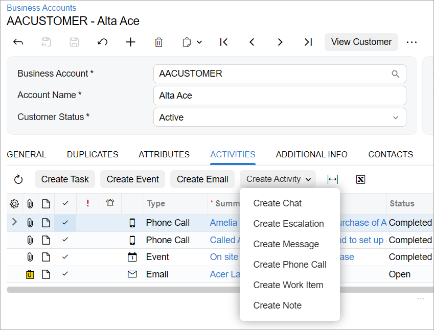 |
| view | Specifies the view from which the data should be displayed in the table. Generally, you do not need to use this property. |
| wrapToolbar |
Shows the More button in the table toolbar, as shown in the following screenshot. 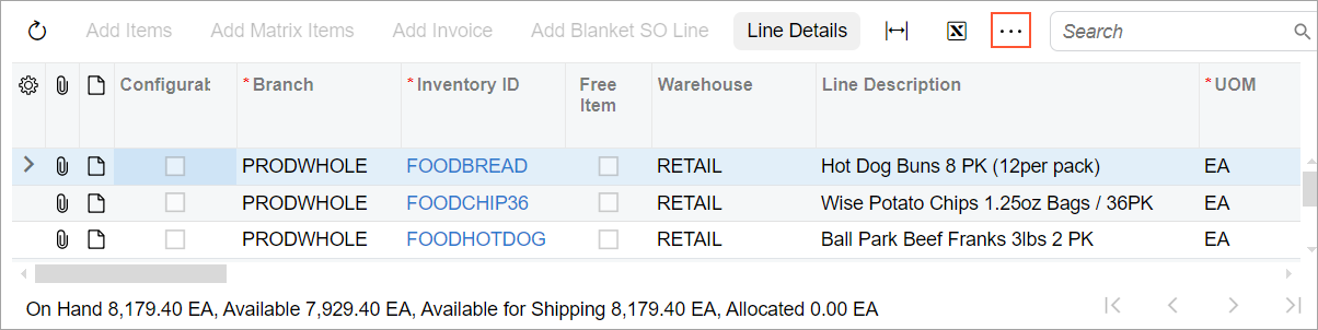 The following code uses this property.
|
columnConfig Decorator
The following table lists the properties of the TypeScript columnConfig decorator, which is used for configuration of a table.
| Property | Description |
|---|---|
| allowCheckAll | If set to true, adds a check box in the header of the column, which
gives the user the ability to select all check boxes in the column on the page. The
following example uses this property. |
| allowFastFilter |
If set to true, includes the field in the list of fields that are used in the fast filter (that is, the search is performed by these fields if a user searches in the table by using the Search box in the table toolbar). No default value is defined. If allowFastFilter is false or undefined for all columns, the search box is hidden. The following code assigns this property. |
| allowFilter | If the value is true, adds column filtering in the header of the column.
The following example uses this property. |
| allowFocus | If set to true, places the cursor in the column when a new record is
added to the table. The following example uses this
property. |
| allowNull | If the value is false, prevents the cell value from being cleared. The
following example uses this property. |
| allowResize | If the value is false, prevents the resizing of the column. The
following example uses this property. |
| allowShowHide | Manages the capability for a user to show or hide the column in the table. (The
user can show or hide the column in the Column Configuration
dialog box.) The property can have one of the following values, which are defined by the GridColumnShowHideMode enum:
The following code shows an example of the use of this property. |
| allowSort | If the value is false, turns off the capability for a user to sort the
values in the column. The following example uses this
property. |
| allowUpdate | If the value is true, indicates that a user can update the value in the
column. The following example uses this property. |
| captionImage | Defines the image that is used for the column header. The image is an SVG icon
from the \Content\svg_icons folder of the MYOB Acumatica instance. The following example uses this
property. |
| dateMask | Defines the date mask for the column, as shown in the following
code. |
| decimals | Defines the number of decimal values to be displayed in the column cells. The
following example uses this
property. |
| displayMode | Specifies the display mode for each cell of the column. The display mode, which
is defined by the GridColumnDisplayMode enum, can be one of the
following:
|
| editorConfig | Defines the configuration for the control that is used for the cells of the
column in inline-edit mode. The following example configures a tree-selector control
for the column cells. |
| editorType | Specifies the name of the control that is used for the cells of the column in
inline-edit mode. The following example defines the
qp-formula-editor control for column
cells. |
| format |
Specifies the custom display format for date and numeric columns. For example,
you can specify For the list of possible values, see Standard numeric format strings and Standard date and time format strings in the Microsoft documentation. The following example uses this property.
|
| fullState | If the value is true, turns on matrix mode for the column. The following
code uses this property. |
| hideViewLink |
Specifies whether the column value should be a link. Every selector control placed in a table becomes a link by default. You use this property to remove the link, as shown in the following
code.
|
| key | Specifies the key for unbound columns, such as Notes and Files. The following
code uses this property. |
| maxLength | Specifies the maximum length of the string in the column. The following code
uses this property. |
| nullText | Specifies the value that is displayed if the column value is NULL. The
following code uses this property. |
| suppressExport | If the value is true, indicates that the column is not included in the
results of the export of the table. The following code uses this
property. |
| textAlign | Specifies the alignment of the values in the column. You can use one of the following values, which are defined in the TextAlign enum:
|
| textField | Specifies explicitly which field should be displayed in the column selector
control. The following code uses this property. |
| timeMode | If the value is true, turns on the time mode for the date and time
column. The following code uses this property. |
| toolTip | Specifies the tooltip for the column. The following code uses this
property. |
| type |
Specifies the type of the column content. You can use one of the following values, which are defined by the GridColumnType enum:
The following code uses this property. |
| valueItems | Specifies the list of values for the drop-down control in inline-edit mode. |
| visible |
If the value is false, hides the column in the table by default. The following code uses this property. Generally, instead of Columns with |
| width | Specifies the width of the column. The width is defined in pixels. The
following code uses this property. |