
Table (Grid): General Information
In a table (or grid), each row represents an object or detail,) and each column shows a text title describing a property of the object or detail in the row. A table can be located on a tab or in a dialog box and have its own toolbar. Alternatively. a table can occupy the whole form, as shown in the screenshot below. In this case, the table toolbar is merged with the form toolbar.
A table is defined by PXGrid in the Classic UI and by
qp-grid in the Modern UI.
Learning Objectives
In this chapter, you will learn the following information about a table:
- The design guidelines for a table, including the naming conventions and layout recommendations
- The proper configuration of a table for specific cases, such as a table with a title or a table with highlighted content
- A detailed description of each property of API elements that are related to a table
Applicable Scenarios
You configure a table in the following cases:
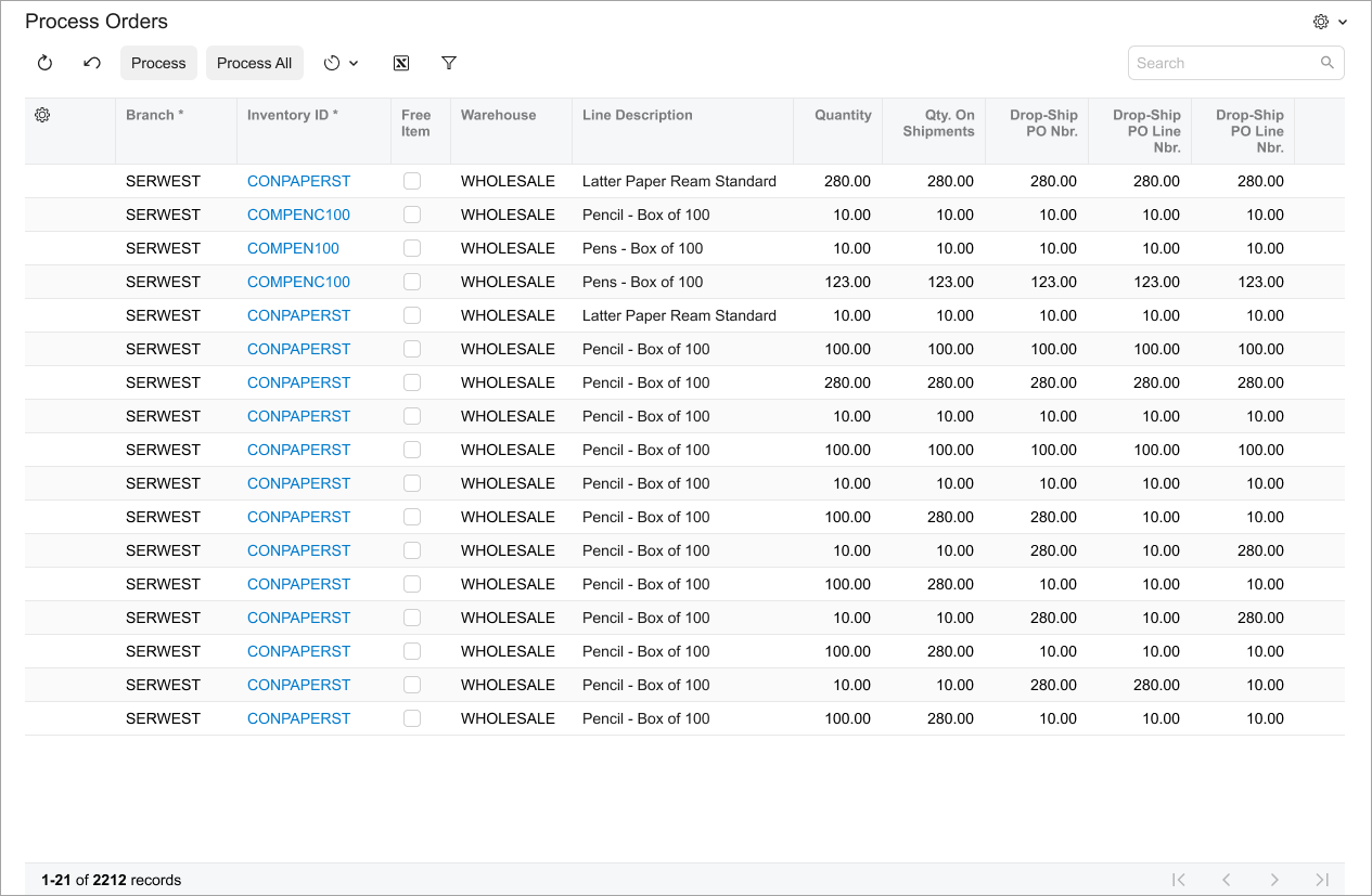
- You need to display multiple database records on an MYOB Acumatica form, such as information about inventory items included in a sales order.
- You need users to sort and filter data easily. Users can click column headers to sort data based on that column or use filter options to narrow down the displayed information.
- For scenarios where users need to input or edit data in a structured format, such as on the Chart of Accounts (GL202500) form, tables provide a familiar and efficient way to do so.
Table ID
An ID of a table in HTML consists of two parts, the grid prefix and the
semantic name. The semantic name describes the purpose of the element. For example, a table that
shows transactions can have the gridTransactions ID, as the following code
shows.
<qp-grid id="gridTransactions"></qp-grid>UI Naming Conventions
The following table shows the UI naming conventions for tables.
| Naming Convention | Example |
|---|---|
| For column names, use a noun or noun phrase (except for the case when the column header contains a check box). Preferably, the phrase should include no more than two words. | The Location Name column on the
Locations tab of the Customers
(AR303000) form, which is shown in the following screenshot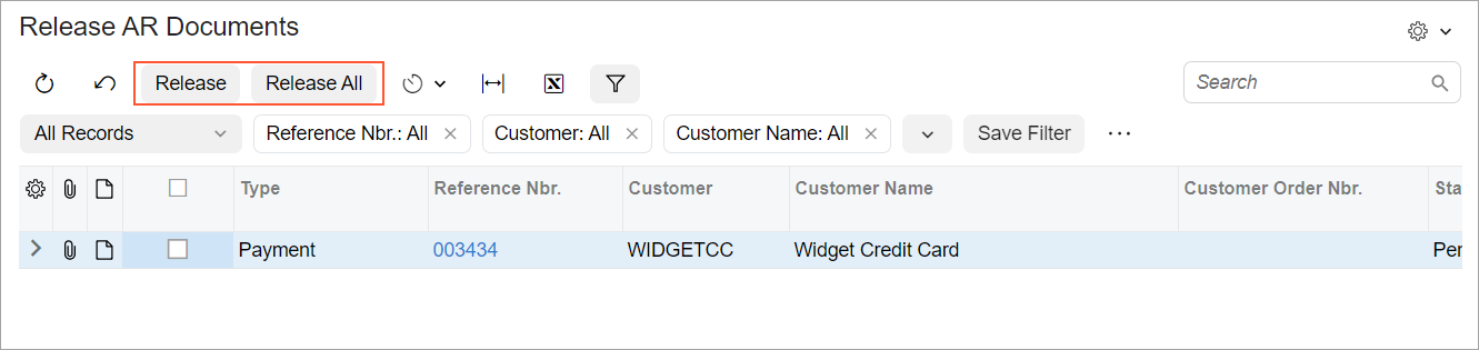 |
|
For names of buttons of table toolbars, use verbs or verb phrases that describe the process initiated when the user clicks the button. |
The Release and Release All buttons on
the Release AR Documents (AR501000) form, which is shown in the
following screenshot |
Recommendations for Organizing Layout
The following table shows the recommendations for organizing the layout for tables.
| Correct | Incorrect |
|---|---|
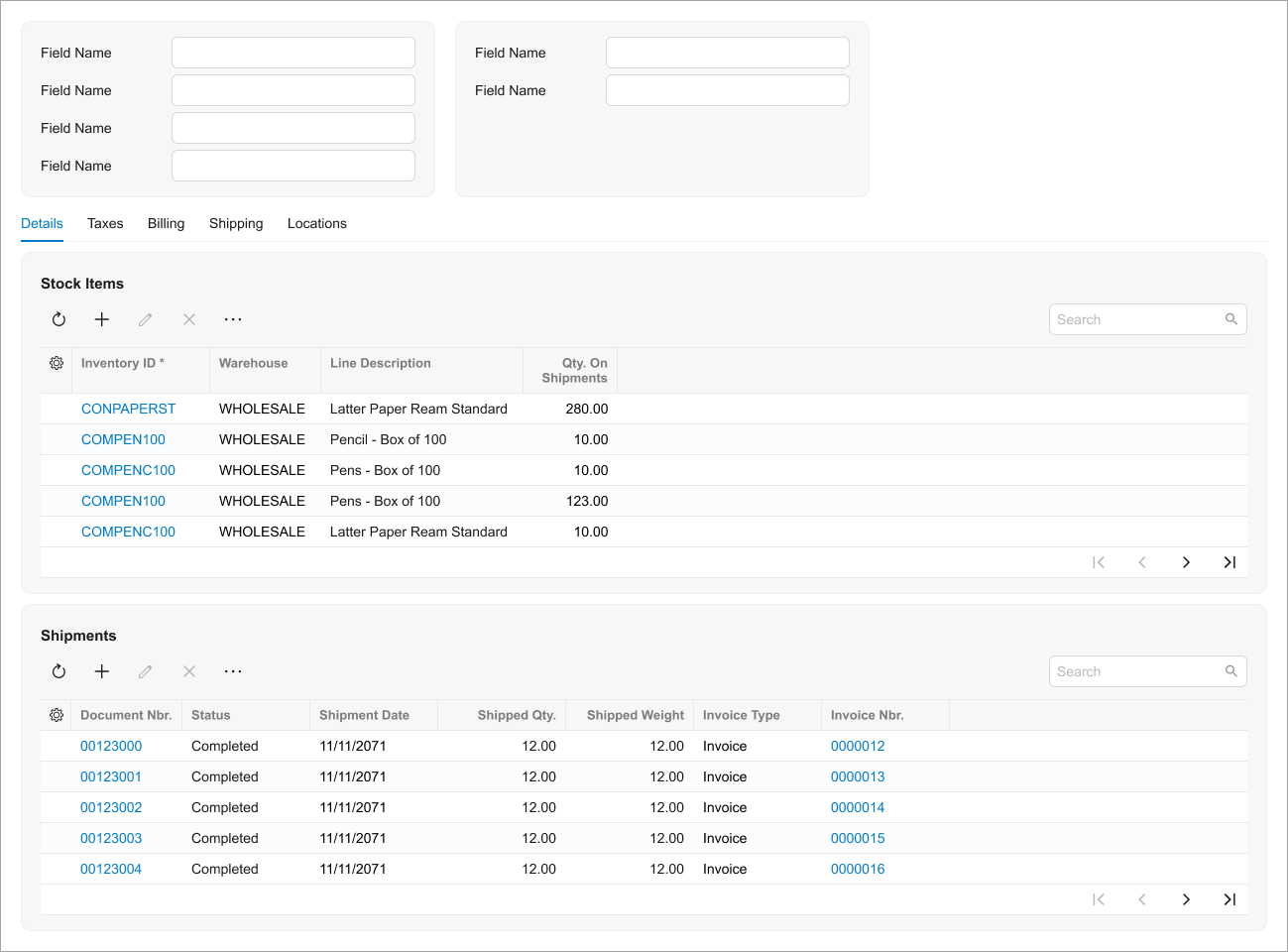
| Show a table without any backgrounds when the table occupies the entire width of the form or popup (including the situation when you have two tables on the form). | |
  |
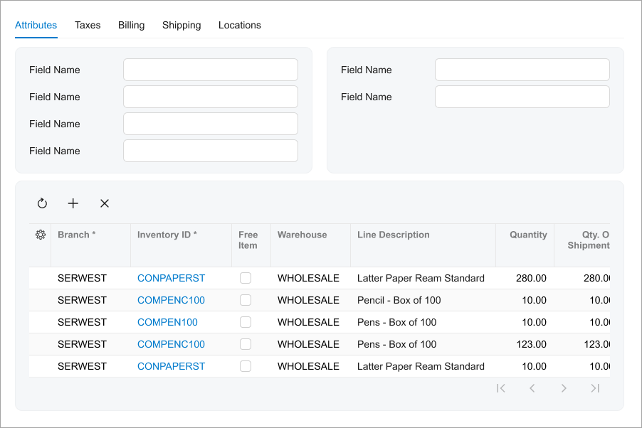  |
Put a table in a gray section when the table is surrounded by
fieldsets. To put a table in a gray section, in the qp-grid tag, specify
class="framed-section". |
|
 |
 |
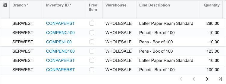
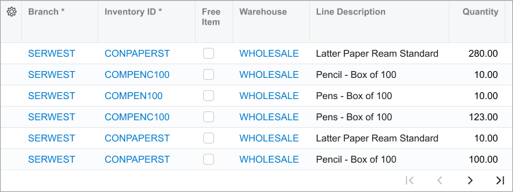
| Show values in columns as links only for the records that are supposed to be open by a user. | |
 |
 |
|
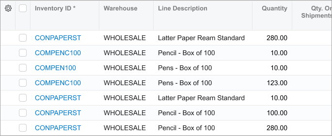
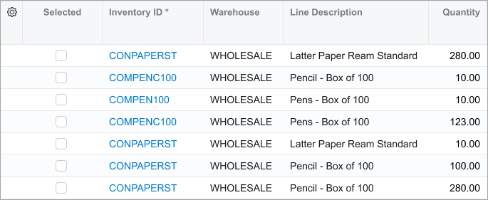
Show as a check box the header for the column with check boxes for selection of a row. Don't use Selected as a name for the column with check boxes for selection of a row. |
|
 |
 |
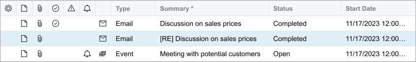
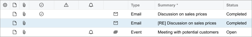
| Make the columns with only icons or check boxes narrow. | |
 |
 |