Advanced Planning and Scheduling: Work Center Planned Utilization
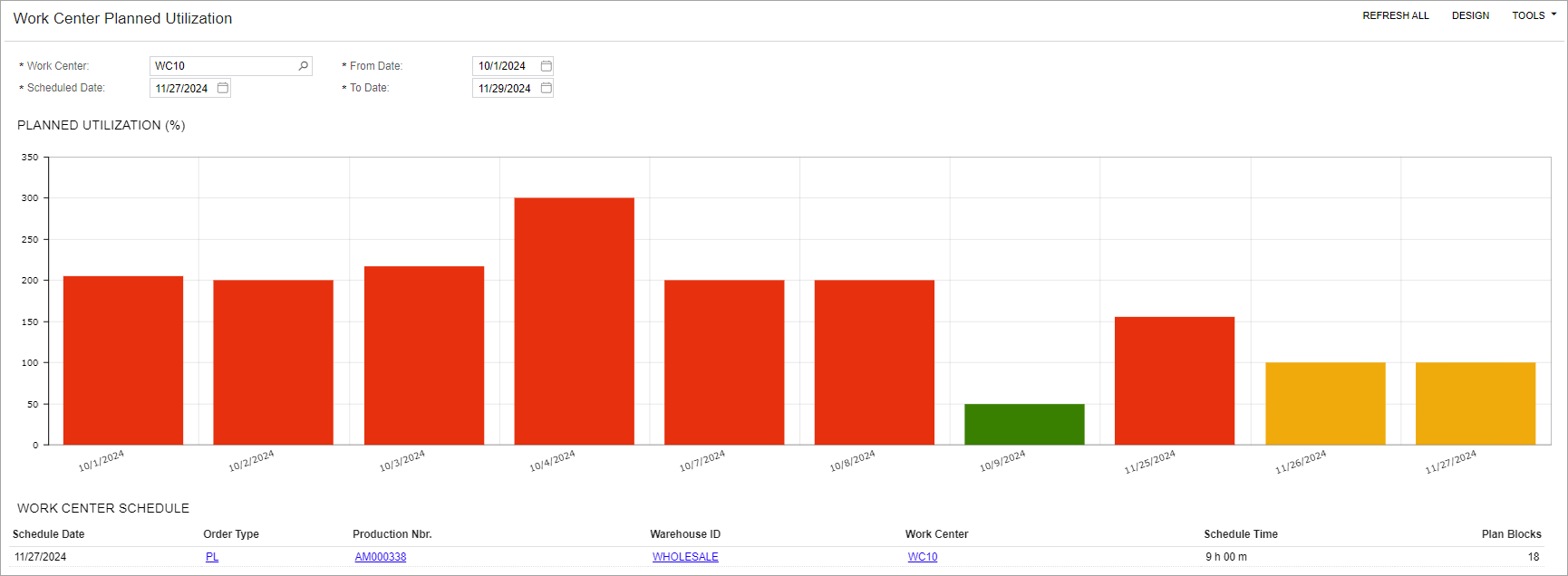
You can view a graphical representation of the planned load for a specific work center on the Work Center Planned Utilization (AM0044DB) dashboard. The dashboard helps manufacturing planners quickly identify overloads and redistribute or reschedule production orders to balance work center loads efficiently.
The Planned Utilization (%) widget displays a bar graph illustrating work center utilization over time. You can select a work center to analyze and define a time range to display the data on the graph. The planned load is shown as a percentage of the work center's capacity. The graph uses the following color coding to represent planned load:
- Green: Planned load is between 0% and 100%.
- Yellow: Planned load is greater than or equal to 100% and less than 101%.
- Orange: Planned load is greater than or equal to 101% and less than 120%.
- Red: Planned load is greater than or equal to 120%.
The Work Center Schedule table below the graph displays information about the production schedule and load details for the date selected in the Schedule Date box. The dashboard is shown in the following screenshot.