
Color Picker Dialog Box
You use the Color Picker dialog box to specify, select, and save a color. The dialog box appears when you click and open any color box in the Background Color or Text Color box on the Calendar Preferences (FS100500) form. This dialog box displays the color page for the selected color, as shown in the screenshot below.
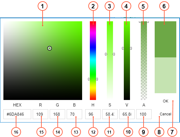
- Color Picker area: You can click in the necessary area to select the necessary color. The circle shows the currently selected color.
- Hue slider: You can move the slider to select the necessary hue of the color.
- Saturation slider: You can move the slider to select the necessary saturation of the color.
- Value slider: You can move the slider to select the necessary lightness or darkness of the color.
- Alpha slider: You can move the slider to select the necessary transparency of the color.
- Color Preview box: In the upper half of the box, you can view the currently selected color and compare it with the previously selected color in the lower half of the box.
- OK button: You click it to select the color and close the color picker.
- Cancel button: You click it to close the color picker without making any changes.
- Alpha value box: You can view or set the numeric value of transparency of the color.
- Value value box: You can view or set the numeric value of lightness or darkness of the color.
- Saturation slider: You can view or set the numeric value of saturation of the color.
- Hue slider: You can view or set the numeric value of hue of the color.
- Blue color box: You can view or set the numeric value of blue component of the color in RGB color format.
- Green color box: You can view or set the numeric value of green component of the color in RGB color format.
- Red color box: You can view or set the numeric value of red component of the color in RGB color format.
- RGB color box: You can view or set the hexadecimal number of the color in RGB color format.