UI Definition in HTML and TypeScript: General Information
The structure of an MYOB Acumatica form in the Modern UI is represented by the following layers:
- The presentation logic in a TypeScript (TS) file, which provides a definition of views and their settings
- The layout of UI elements displayed on the form in HTML
Learning Objectives
In this chapter, you will learn how to do the following:
- Define the presentation logic and layout of a form in the Modern UI
- Use the built-in converter to convert a form from the Classic UI to the Modern UI
Applicable Scenarios
You define an MYOB Acumatica form in HTML and TypeScript in the following cases:
- In a customization project, you have developed an MYOB Acumatica form for the Classic UI. Now you need to convert this form to the Modern UI to continue supporting it in future versions of MYOB Acumatica.
- You’re developing a new MYOB Acumatica form.
Controls of the Modern UI
Controls are building blocks for the layout of an MYOB Acumatica form. Each control is composed of an HTML template and a TypeScript class.
A control can have the following attributes:
- config: An attribute whose properties define the appearance and behavior of the control. Any changes to the values of these properties made in the browser are not passed to the server and can be overwritten by the server on each round trip.
-
value: The value displayed in the control, which can be changed both in the browser and on the server.
- id: An identifier of the control, which is a shortcut for the id property of the config attribute.
-
Other bindable attributes, which are shortcuts bound to the properties in the config attribute.
You can change config directly in HTML. You can specify particular properties defined in config in one of the following ways:
- Specify a set of properties by using
config.bind, as the following code shows:config.bind="{imageSet: 'main', imageKey: 'Refresh'}" - Specify a single property, as the following code shows:
config-allow-edit.bind="true"
All controls can be divided into the following categories:
- Simple controls (which are bindable to server fields)
- Containers (which hold other controls)
- Compound controls (which are usually bindable to a view or have their own controller)
- Abstract controls (which serve as a basis for other control types)
For simple controls, you typically do not specify their type, such as qp-checkbox, in HTML. Instead, you use the field tag in HTML. The server automatically defines the type of the field in the Modern UI. The PX*FieldAttribute attribute that is assigned to the field in the backend code creates a specific type, which is an inheritor of PXFieldState. This type affects the default control used by the client.
<qp-grid .../> or <qp-button .../>. An HTML
limitation prohibits shortened version of tags except for a limited number of standard HTML
tags.MYOB Acumatica Form in the Modern UI
You can find the source code of the Modern UI of original MYOB Acumatica forms in the FrontendSources\screen\src\screens folder of the MYOB Acumatica instance folder.
Below you can see an example of the hierarchy of the files and folders of the Modern UI.
Site
- FrontendSources/screen/src/screens
- - GL
- - - GL401000
- - - - extensions (optional)
- - - - - GL401000_extension1.html
- - - - - GL401000_extension1.ts
- - - - - GL401000_extension2.html
- - - - - GL401000_extension2.ts
- - - - GL401000.html
- - - - GL401000.ts
- - - - views.ts (optional)
The FrontendSources\screen\src\screens folder contains subfolders with two-letter names. Each subfolder contains the source code of the forms whose screen IDs start with these letters. For each form, the subfolder contains a folder with the screen ID as the folder name, such as GL401000. This folder contains the HTML and TS files that have the screen ID as the file name, such as GL401000.ts and GL401000.html. For large forms with many data views, such as Sales Orders (SO301000), view definitions may be located in separate files with the views.ts name.
import{
	SOOrder,
	BlanketTaxZoneOverrideFilter
} from './views';
The extensions folder contains TS and HTML files for extensions of the form. Each file name starts with the screen ID and ends with a postfix that indicates the purpose of the extension, such as GL401000_MultiCurrency.ts.
You can define the views and layout in extensions of the form:
- For the areas of the form that are specific to particular features.
- For the definitions of dialog boxes (which are also called smart panels in the Classic UI).
- For the definitions of tabs. However, for tabs in extensions, you need to specify that the tab has an external definition and provide its ID by using the ref attribute of the qp-tab tag. For details, see Tab: Configuration.
- For any UI customization of the form. For details about UI customization, see UI Customization Development: General Information.
Screen Class in TypeScript
To define the views of an MYOB Acumatica form in TypeScript, in the TS file of the form, you define a screen class—a class for the form—as shown in the following code.
import {
    graphInfo,
    PXScreen
} from "client-controls";

@graphInfo({
    graphType:'PX.Objects.GL.AccountHistoryEnq',
    primaryView:'Filter'
})
export class GL401000 extends PXScreen {
}The screen class must satisfy the following requirements:
-
It has the screen ID as the name of the class, such as
GL401000. -
It extends the PXScreen class.
-
It has the graphInfo decorator, in which you specify the graph and its primary view.Tip:You can also specify optional parameters of the graphInfo decorator and use other decorators.Attention:In the Modern UI, each MYOB Acumatica form must use its own graph type.
In the screen class, you define a property for each data view, as shown in the following code.
import {
    graphInfo, PXScreen, createSingle
} from "client-controls";

@graphInfo({
    graphType:'PX.Objects.GL.AccountHistoryEnq',
    primaryView:'Filter'
})
export class GL401000 extends PXScreen {
  @viewInfo({containerName: 'Filter'})
  Filter = createSingle(GLHistoryEnqFilter);
}
This property must satisfy the following requirements:
-
It has the same name as the name of the data view. You will use this name to bind a UI control to the data view in HTML.
-
It has the viewInfo decorator with the specified container name. (This name is used as an object name during the configuration of particular functionality, such as workflows and import and export scenarios. If this value is not specified, the system displays the name of the data view as the object name.)
-
If you need to display a form control, the property is initialized with the createSingle method, which takes as the input parameter an instance of the view class (described below).
-
If you need to display a table (grid) or a tree, the property is initialized with the createCollection method, which takes as the input parameter an instance of the view class. You can specify configuration parameters for the table by using the gridConfig decorator and for the tree by using the treeConfig decorator.
Tip:The createCollection method can be also used when multiple records need to be displayed and these records are rendered without a predefined MYOB Acumatica control, such as in the Outlook plug-in.
View Classes in TypeScript
In the TS file of the form, for each view of the graph, you define a view
class—that is, a class for each view of the graph—as shown in the following
code. The class extends the PXView class.
For the view classes that are added in a customization project, we recommend that you keep the prefix in the name. The prefix consists of the two-letter identifier indicating the part of the functional area and a two-letter prefix of the application area.
import {
    PXView
} from "client-controls";

export class GLHistoryEnqFilter extends PXView {
}Description: PXFieldState;
ShowCuryDetail: PXFieldState<PXFieldOptions.Hidden |
PXFieldOptions.CommitChanges>;
OrderDate: PXFieldState<PXFieldOptions.CommitChanges>;You specify the type of each property, which can be one of the following:
- PXFieldState.
PXFieldState<list_of_options>,where you specify the options by using thePXFieldOptionsenum. The options can be combined.
You can also use decorators for fields. For details about decorators for fields, see Fieldset: Field Configuration.
For details about how to add a field from a joined data access class of the data view, see UI Definition in HTML and TypeScript: Joined Fields.
Action Definitions in TypeScript
The actions that are defined in the graph or in the workflow have corresponding commands displayed on the More menu by default. You do not need to define them in the TypeScript code of the MYOB Acumatica form.
However, if you need to place a button for an action somewhere on the form other than the toolbar or the More menu, you need to include the action’s definition in TypeScript. For details, see Button: Configuration.
Layout in HTML
In the HTML file, you define the layout of an MYOB Acumatica form, as shown in the following example. You must place all HTML controls inside the template tag.
<template>
<qp-template id="form-Filter" name="7-10-7" class="equal-height">
<qp-fieldset id="fsColumnA-Filter" slot="A" view.bind="Filter">
<field name="OrderDate"></field>
<field name="ShowCuryDetail"></field>
</qp-fieldset>
<qp-fieldset id="fsColumnB-Filter" slot="B" view.bind="Filter">
<field name="Description"></field>
</qp-fieldset>
</qp-template>
<qp-grid id="grid-Details" view.bind="transactions"></qp-grid>
</template>In the HTML file, you use the rules described in the following resources:
-
Designing the Layout of an MYOB Acumatica Form, which covers the general approach you should follow
-
UI Component Guide, which provides guidelines for particular UI elements
UI Components of an MYOB Acumatica Form
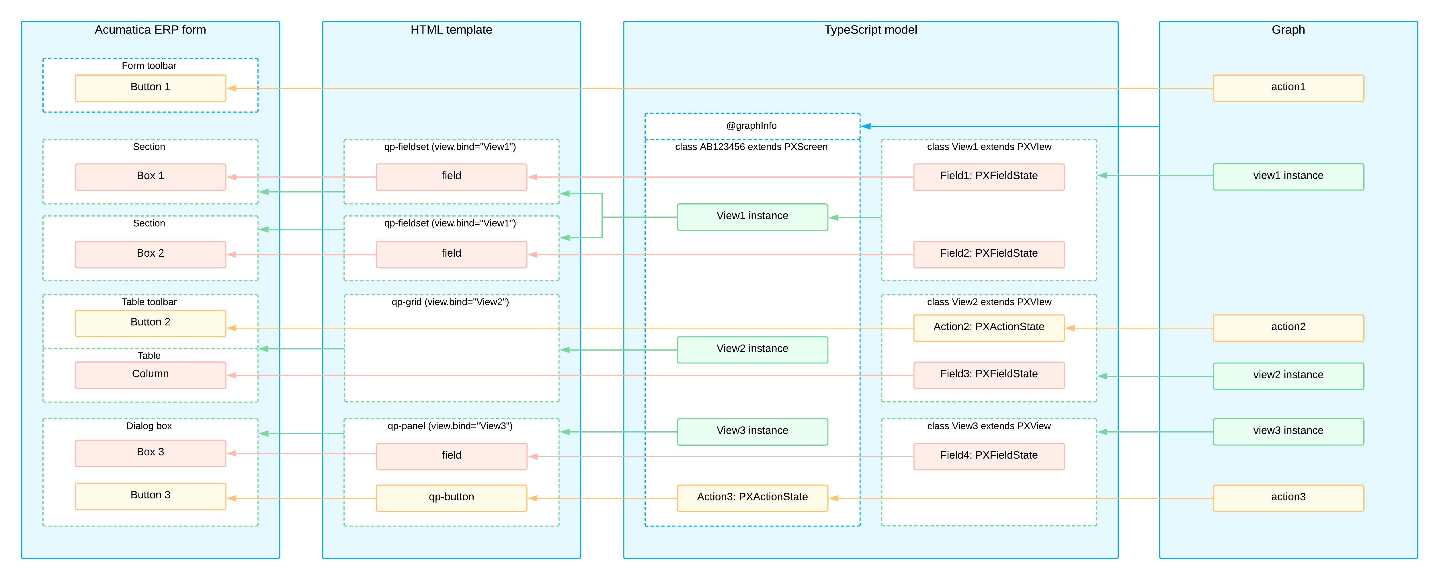
The following diagram shows the UI components of an MYOB Acumatica form and the interactions between them.