- Contents
- Index
- Search

Display results with all search words
Standard Dashboards
A library of dashboard widgets is included by default with MYOB Exo Business. Widgets are available for the core Exo Business module, as well as several of the additional modules like Exo Job Costing, Exo CRM and the Exo Accountant's Assistant. All dashboard widgets are available in the Admin > Dashboards > Setup Widgets section of Exo Business Config (sort this view by Widget Type to find the widgets that are based on Exo Clarity reports). Before designing dashboard widgets of your own, it can be useful to browse through these to get ideas for how information can be presented on a dashboard display.
Common Dashboard Features
Many of the dashboard widgets supplied with Exo Business include interactive graphical features that let users change the information displayed by the widget or change the way the information is displayed. These features can be a good way of including more information on a small widget - by showing only a subset of the available data but giving users the ability to customise the data that appears, you can make a lot of information available without taking up a lot of space.
For example, the Top Customer by Margin widget (which displays the report DashTopCustByMargin.CLR) offers radio buttons and a tabbed interface to control how much data is displayed, and the option of toggling between a graphical and tabular presentation of the data:
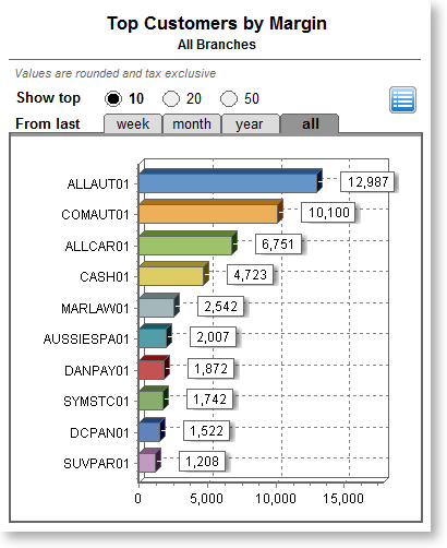
These features and others are discussed below, to give you an idea of how might set up and use them in your own dashboard widgets. Some of them use custom programs created specifically for the Exo Business dashboards to achieve their effects.
Radio Buttons

These are used in the range selection for the "Top" reports, to show for example, the Top 10 Suppliers by Spend. While radio buttons are used extensively in Windows forms and web pages, Exo Clarity does not have a radio button tool, so these were created with circle Shape components, text Label components and click events. When an option is selected, the circle fill colours are changed, the selected option's text is shown in bold, the relevant filter options are changed, and the report is refreshed.
Tabs

These give the appearance of a tabbed sheet, where clicking a tab brings that sheet to the front. This feature is created simply using rounded rectangle Shape components with some text placed on top. The rectangles have an OnDrawCommandClick event handler which changes the colour of the rectangles, sets the new filter value and refreshes the report. The colours are designed to merge into the panel below when selected.
Text/Chart Buttons


Several reports include a button to switch between graphical and tabular views of the data. These buttons are Image components placed in the same position. When clicked, they simply toggle a global variable which stores the current state, then hides what shouldn't display and shows what should.
Progress Meter

While it would be possible to implement a progress bar like this with a Chart, it can be done easily with simple graphical components. This feature was implemented as a few rectangle Shape components and a text Label component. The length of the bar is determined as a percentage of the total length of the meter, based on the length of the period and the current day of that period.
Charts
The standard dashboard widgets make extensive use of Chart components to show data in a compact format that shows information at a glance. Many dashboard views use more than one chart, and most of them use more than one data series in each chart, showing and hiding the series as required.