
Wizard: General Information
You can configure a wizard control to divide multiple controls into several steps and make it easier for a user to provide values. In this topic, you will learn about the wizard control, its components, and its configuration.
Learning Objectives
In this chapter, you will learn the following about the wizard control:
- The design guidelines for the wizard control, including the naming conventions and layout recommendations
- The proper configuration of the wizard control for specific cases
Applicable Scenarios
You configure the wizard control when you want to a user to provide values for multiple fields and guide a user through a sequence of discrete steps.
Overview of the Wizard Control
A wizard is a control that can consist of one step or multiple steps, each of which focuses on a part of a larger process. Each step may include instructions or prompts and a set of controls, such as boxes and tables, where users can view and enter data. A user can navigate between steps by clicking buttons at the bottom of the wizard.
The wizard control includes the following components:
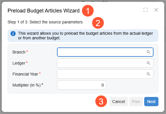
- A title at the top of the wizard (Item 1 in the screenshot)
- A set of steps; Item 2 in the screenshot below shows the first step of the wizard. The wizard can display only one step at a time.
- The bottom toolbar with buttons (Item 3). A toolbar contains the following buttons depending on the step of the wizard:
- Cancel: This button is active on each step of the wizard.
- Prev: This button is active on each step of the wizard except the first one.
- Next: This button is active on each step of the wizard except the last one.
- Done: This button is displayed only on the last step of the wizard.
A wizard is defined by PXWizard in the Classic UI. In the Modern UI, a wizard can be defined by the qp-wizard control.
To define each step of the wizard, you should use the qp-tab control inside the qp-wizard control.
Configuration of the Wizard Control
A wizard control is typically displayed inside a dialog box, but it can also be displayed in a container control of a form, such as a tab or the Summary area
To define a wizard control, do the following:
- In TypeScript, define the configuration of the wizard control.
The following code shows a configuration that specifies the title of the wizard and an action for the Next button of the wizard. For details, see Wizard: Configuration of Buttons.
export class GL302010 extends PXScreen { wizardConfig: IWizardConfig = { caption: ImportMessages.WizardCaption, nextCommand: "wizardNext" }; } - In TypeScript, define views for the controls that are displayed on different steps of the wizard.
- In HTML, add the qp-wizard tag. In the config.bind
property, specify the configuration from Instruction 1.
The following code shows how to specify the configuration that was defined in TypeScript.
<qp-wizard id="wizardBudgetArticles" config.bind="wizardConfig"> </qp-wizard>Note:If you need to define a wizard inside a dialog box, put the qp-wizard tag inside the qp-panel tag, which corresponds to a dialog box. The caption specified for the qp-panel tag is the title of the wizard. - In the qp-wizard tag, define the layout of each step in a qp-tab tag, as shown in the
following code.
To specify the title of the step, use the caption attribute of the qp-tab tag. The "Step X of Y:" prefix is calculated and added automatically to the caption string.
<qp-tab id="tabWizardBudgetArticles-SourceParameters"
  caption="Select the source parameters"">
  <qp-info-box caption="This wizard allows you to ..." type="info"></qp-info-box>
  <qp-template id="formWizardBudgetArticles-SourceParameters" name="1">
    <qp-fieldset slot="A" id="panelWizard-SourceParameters" view.bind="PreloadFilter">
      <field name="branchID"></field>
      ...
    </qp-fieldset>
  </qp-template>
</qp-tab>
The overall structure of the qp-wizard control in HTML can look as shown in the following code.
<qp-wizard ...>
  <qp-tab ... > <!-- step 1 --> </qp-tab>
  <qp-tab ... > <!-- step 2 --> </qp-tab>
  <qp-tab ... > <!-- step 3 --> </qp-tab>
</qp-wizard>
Wizard and Step IDs
An ID of a wizard in HTML consists of two parts: the wizard prefix and the
semantic name. The semantic name describes the purpose of the element. For example, a wizard
that helps users preload budget articles may have the wizardBudgetArticles
ID, as the following code shows.
<qp-wizard id="wizardBudgetArticles" config.bind="wizardConfig">Each step of the wizard that you implement by using the qp-tab tag can also have an ID. An ID of a tab consists of the following parts:
- The
tabprefix. - The ID of the wizard.
- A hyphen.
- The semantic name of the step. This name describes the contents of the step.
For example, a tab that step with the source parameters of a budget article may have the
tabWizardBudgetArticles-SourceParameters ID, as the following code
shows.
<qp-wizard id="wizardBudgetArticles" config.bind="wizardConfig">
  <qp-tab id="tabWizardBudgetArticles-SourceParameters">
  </qp-tab>
</qp-wizard>