Selector: Differences between the Classic UI and the Modern UI
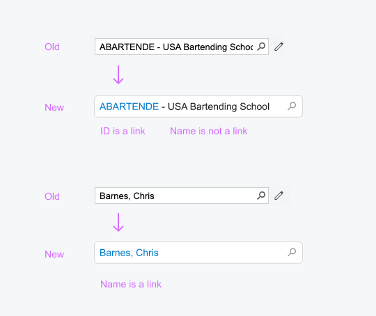
The following screenshots demonstrate the difference between the PXSelector
control in the Classic UI and
the qp-selector control in the Modern UI.
The new selector control does not have the Edit button, which gave users of the Classic UI the ability to open the selected record for editing. Instead, in the Modern UI, the selector control displays a link to the selected record. A user clicks the link to open the record in a new window. For details on configuring a link in the selector control, see Selector: Configuring a Link.
To create a new record for a selector control in the Modern UI, a user needs to click the magnifier button and then click + on the toolbar of the lookup table. (In the Classic UI, a user could do this by clicking the Edit button for an empty selector control.)

