
Radio Button: General Information
A radio button is a small circle that a user can click to turn on or turn off an action, as shown in the following screenshot. Radio buttons are generally organized in groups in which a user is permitted to select only one of the radio buttons.
A group of radio buttons is defined by PXGroupBox with nested PXRadioButton elements in the Classic UI. In the Modern UI, you define a group of radio buttons by using the field tag with the control type specified in TypeScript or explicitly by using the qp-radio control.
Learning Objectives
In this chapter, you will learn the following about radio buttons:
- The design guidelines for radio buttons, including the naming conventions and layout recommendations
- The proper configuration of radio buttons for specific cases, such as including an additional box next to a radio button option
Applicable Scenarios
You configure radio buttons when a user needs to select one of the buttons from a set of mutually exclusive options and you want all options to be visible at once.
UI Naming Conventions
The following table shows the UI naming conventions for radio buttons.
| Naming Convention | Example |
|---|---|
|
Use either of the following phrases as the names of a group of radio buttons:
The radio button names should be parallel with one another. |
The Equipment Class radio buttons on the Stock Items (IN202500) form, which is shown in the following
screenshot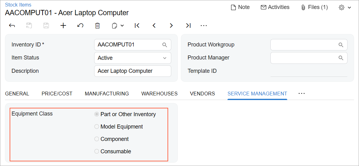 |
Recommendations for Organizing the Layout
The following table shows the recommendations for organizing the layout for radio buttons.
| Correct | Incorrect |
|---|---|
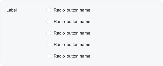
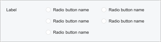
| If there are more than two radio buttons, list them vertically. Do not arrange radio buttons in multiple columns if there are more than two of them. | |
 |
 |
| If the area where you are going to place the control has enough space, the control is used often (such as in a wizard or a dialog box), and the list of options contains no more than five options, use radio buttons instead of a combo box to avoid a user spending extra time on opening the option list in the combo box, scanning the list, and selecting an option. | |
 |
 |