
Check Box: Layout Examples
In this topic, you can find examples of configurations of layouts with check boxes.
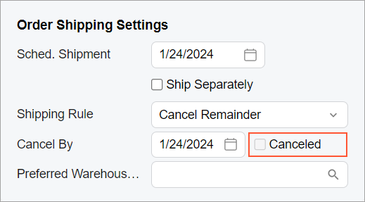
Check Box Next to a UI Element
Suppose that you want to place the Canceled check box next to the Cancel By box in the same row, as shown in the following screenshot.
You use the following code.
<field name="CancelDate">
  <qp-field control-state.bind="CurrentDocument.Cancelled"
    config-enabled.bind="false"></qp-field>
</field>class="no-label" for the
second control to omit the empty label of the check box because
class="no-label" is used by default for a qp-field
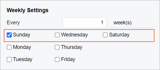
tag inside a field tag.Multiple Check Boxes in a Row
Suppose that you need to display three check boxes in a row, as shown in the following screenshot.
The following code implements this layout.
<field name="fake01" unbound replace-content>
    <qp-field control-state.bind="StaffScheduleSelected.WeeklyOnSun"
      config-enabled.bind="false" class="col-4"></qp-field>
    <qp-field control-state.bind="StaffScheduleSelected.WeeklyOnWed"
      config-enabled.bind="false" class="col-4"></qp-field>
    <qp-field control-state.bind="StaffScheduleSelected.WeeklyOnSat"
      config-enabled.bind="false" class="col-4"></qp-field>
</field>
You do not need to set class="no-label" to remove the label before each
check box because this class is used by default in this case.
You have distributed the check boxes equally with class="col-4", which
means that each check box occupies four (12 / 3 = 4) columns out of 12 columns that the
replaced field occupies. (If you need to have four columns and need to distribute them
equally, you should use class="col-3".)