
Check Box: General Information
A check box is a control in which a user makes a choice between two mutually exclusive options.
A check box is defined by PXCheckBox in the Classic UI. In the Modern UI, a check box is defined by the field tag (whose control type is automatically defined as a check box from the backend code). In rare cases, a check box in the Modern UI is defined explicitly by the qp-check-box control.
Learning Objectives
In this chapter, you will learn the following information about a check box:
- The design guidelines for a check box, including the naming conventions and layout recommendations
- The proper configuration of a check box for specific cases, such as when a check box is located next to another element in the same row.
- A detailed description of each property of a check box
Applicable Scenarios
You configure check boxes in the following user scenarios:
- A user can select multiple items in a list of items, such as selecting items from a list of preferences.
- A user chooses one option from two possible options, such as enabling or disabling a feature.
- A user selects a specific criterion to apply to the displayed information to filter or sort data.
UI Naming Conventions
The following table shows the UI naming conventions for a check box.
| Naming Convention | Example |
|---|---|
| For a check box that (if selected) enables an action, use a verb or verb phrase that describes this action. | The Copy Tag Number from Asset ID check box on the Fixed Assets Preferences (FA101000) form, which is shown in the following
screenshot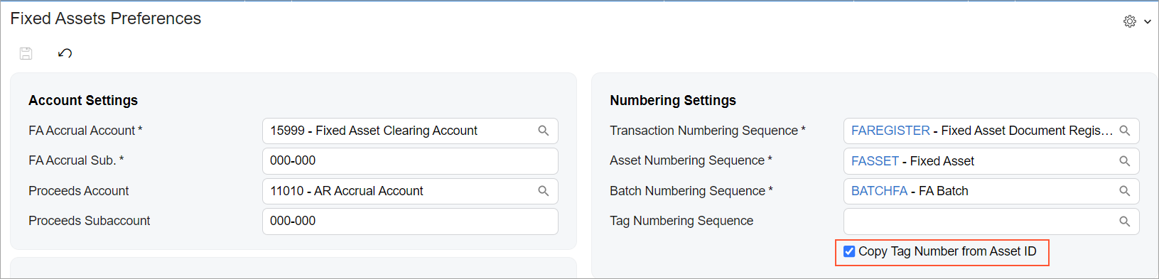 |
| For a check box that (if selected) gives an entity some property, use a noun or noun phrase. | The Reverse VAT check box on the Taxes (TX205000) form, which is shown in the following
screenshot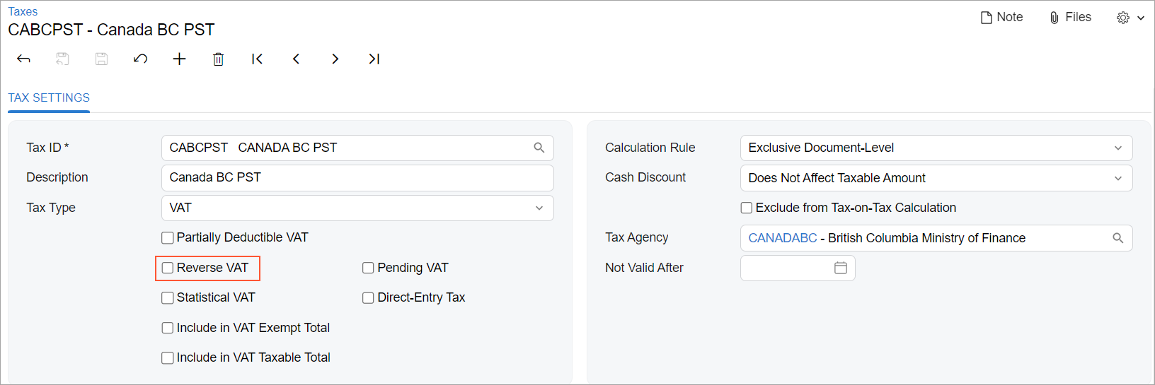 |
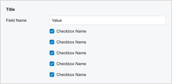
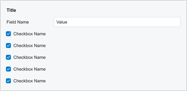
Recommendations for Organizing the Layout
The following table shows the recommendations for organizing the layout for check boxes.
| Correct | Incorrect |
|---|---|
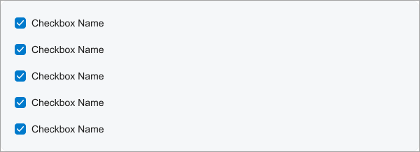
| When a fieldset contains only check boxes, align the check
boxes without left padding. To remove the left padding, specify
|
|
 |
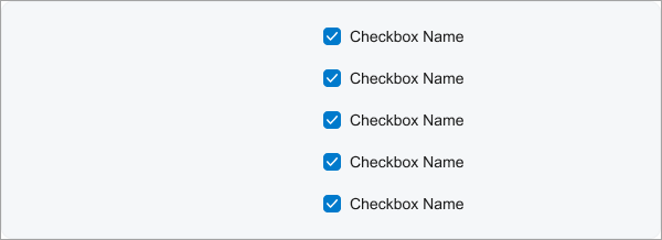 |
| Keep the default left padding for check boxes in a section if the section contains other controls and has a title. | |
 |
 |