
Address Lookup: Layout Examples
In this topic, you can find examples of ways to configure various layouts with Address Lookup buttons.
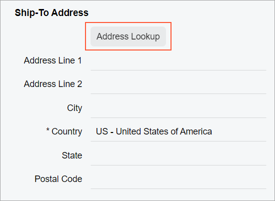
Address Lookup Button at the Top of a Fieldset
You can add an Address Lookup button at the top of a fieldset, as shown in the following screenshot.
To add an Address Lookup button, you add a field
tag with the unbound attribute and nest the
qp-address-lookup tag within it, as shown in the following code
example.
<field name="FakeField" unbound>
  <qp-address-lookup class="col-12" view.bind="Shipping_Address">
  </qp-address-lookup>
</field>
Address Lookup Button Below a UI Element
You can add a button after another control so that it is displayed on the next line below the
control. To do that, you need to add the button control inside the field tag and
specify class="col-12" for the button control.
For example, suppose that you need to place the Address Lookup button on the next line after a check box, as shown in the following screenshot.
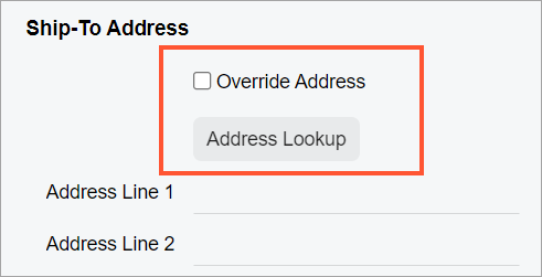
The Address Lookup button is implemented by using the qp-address-lookup tag. The following code shows an example of moving the Address Lookup button to the next line.
<field name="OverrideAddress">
  <qp-address-lookup class="col-12" view.bind="Shipping_Address">
  </qp-address-lookup>
</field>