
Time Span: General Information
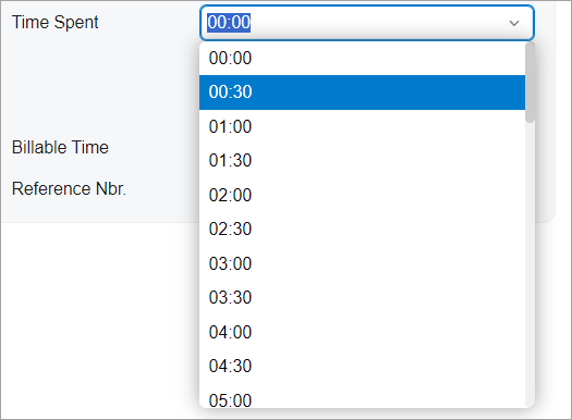
A time span is a drop-down control that combines a text box with a list of options. The
options of the control represent the time periods from 0 to 24 hours in the following format:
XX:YY, where XX is the number of hours, and
YY is the number of minutes. An example of a time span control is shown in the
following screenshot.
A time span control is defined by the PXTimeSpan tag in the Classic UI. In the Modern UI, a time span is defined by the field tag, whose control type is automatically defined as a time span from the backend code. In rare cases, a time span in the Modern UI is defined explicitly by the qp-time-span tag. If the control is used in a column, the control is defined with the qp-time-span editorType in the controlConfig decorator.
The time span control is implemented as an extension of the selector control, so it has the same base properties and behavior.
Learning Objectives
In this chapter, you will learn the following about a time span control:
- The design guidelines for the time span, including the naming conventions and layout recommendations
- The details of each property of the time span
Applicable Scenarios
You configure a time span control when you need to add a control where a user can select a period of time, such as the amount of time spent on an activity.
UI Naming Convention
The following table shows the UI naming convention for a combo box.
| Naming Convention | Example |
|---|---|
| Use a noun or a noun phrase to describe the contents of a time span control. Preferably, time span names should consist of one or two words. | The Time Spent and Billable Time time
span controls on the Activity (CR306010) form, which is
shown in the following screenshot.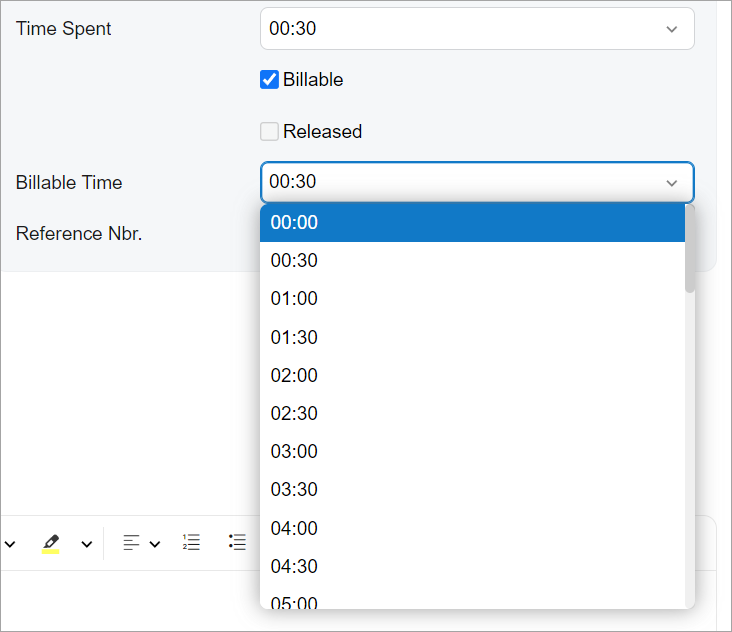 |
Adding the Time Span Control in a Table
To add the time span control in a column of a table, specify the editorType
property of the columnConfig decorator. To allow a user to edit the value in
the cell by typing it, specify renderEditorText: true, as shown in the
following example.
@columnConfig({ renderEditorText: true, editorType: "qp-time-span" })
TimeSpent: PXFieldState<PXFieldOptions.CommitChanges>;
Differences Between the Classic UI and the Modern UI
In the Classic UI, a user could only do one of the following: enter the number of minutes or the number of hours, or select an existing value from the list.
While using the time span control in the Modern UI, a user can enter both hours and minutes at the same time and enter the colon symbol between them—for example, 1:40, meaning 1 hour and 40 minutes. This functionality is supported by default, so you do not need to specify additional parameters.
Default Configuration
By default, the time span control has the following configuration:
- It is optional (
required: false). - String values are allowed in the control (
valueType: NetType.String). - The suggester is turned off (
autoSuggest : null). - Empty values are allowed (
allowNull : true). - The list of options in the drop-down list is empty (
options : null).