
Label: A Combo Box Control as a Label
You can define a control, such as a combo box to occupy the space of a label.
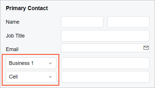
Suppose that you need to display a combo box in place of a label for another control, as shown in the following screenshot.
In the HTML template, you need to add a field for that label by using the
qp-field tag and specify the following attributes for the field:
slot="label"to display that control in space for the label of the parent controlclass="no-label"to remove the space allocated for the label part of that control
The following code shows an example that implements the layout from the screenshot above.
<field name="Phone1">
  <qp-field slot="label" class="no-label"
    control-state.bind="PrimaryContactCurrent.Phone1Type">
  </qp-field>
</field>
Alternatively, you can add both fields explicitly, as shown in the following code.
<field name="groupPhone1" unbound>
  <qp-field slot="label" class="no-label"
    control-state.bind="DefContact.Phone1Type"></qp-field>
  <qp-field class="col-12 no-label"
    control-state.bind="DefContact.Phone1" ></qp-field>
</field>