
Combo Box: General Information
A combo box is a drop-down control that combines a text box with a list of options. It can consist of any number of values that a user can select. You can configure a combo box so that the user can select more than one value.
A combo box is defined by PXDropDown in the Classic UI. In the Modern UI, a combo box is defined by the field tag, whose control type is automatically defined as a combo box from the backend code. In rare cases, a combo box in the Modern UI is defined explicitly by the qp-drop-down control.
Learning Objectives
In this chapter, you will learn the following about a combo box:
- The design guidelines for a combo box, including the naming conventions
- The details of each property of a combo box
Applicable Scenarios
You configure combo boxes in the following user scenarios:
- A user needs to select a single item or multiple items from a finite list of items, such as selecting items from a list of preferences.
- A user needs to selects a specific criterion from a predefined list of options to apply a filter or sort data.
UI Naming Convention
The following table shows the UI naming convention for a combo box.
| Naming Convention | Example |
|---|---|
| Use a noun or a noun phrase to describe the contents of a combo box. Preferably, combo box names should consist of one or two words. | The Customer Status combo box on the Customers (AR303000) form, which is shown in the following
screenshot.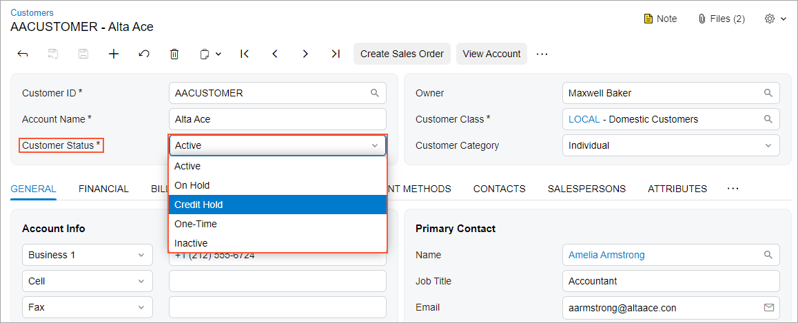 |
Recommendations for Organizing the Layout
The following table shows the recommendations for organizing the layout for combo boxes.
| Correct | Incorrect |
|---|---|
| If the area where you are going to place the control has enough space, the control is used often (such as in a wizard or a dialog box), and the list of options contains no more than five options, we recommend that you use radio buttons instead of a combo box to avoid a user spending extra time on opening the options list in the combo box, scanning the list, and selecting an option. | |
 |
 |