
Color Picker: General Information
A color picker is a group of controls and the Color Picker dialog box, which give a user the ability to select a color.
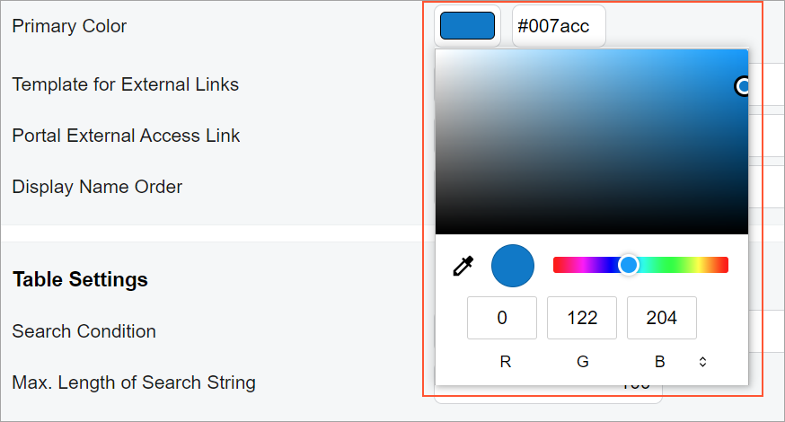
The following screenshot shows an example of this control.
In the Classic UI,
the color picker control is defined by the PXTextEdit tag with the
TextMode="Color" attribute. In the Modern UI,
the color picker control is defined by the qp-color-picker tag.
Learning Objectives
In this chapter, you will learn the following about the color picker:
- The design guidelines for the color picker control
- The proper configuration of the color picker control
Applicable Scenarios
You configure the color picker control when you want a user select an arbitrary color from a dialog box.
Design Guidelines
A color picker is implemented as a field tag with a
control-type="qp-color-picker" attribute, as shown in the following
code.
<field name="PrimaryColor" control-type="qp-color-picker"></field>The default value of the color picker is specified in the backend code.
control-type="qp-color-picker" for
fields that have the PXColorState state, such as the fields that have
PXColorListAttribute specified on the DAC field.