- Contents
- Index
- Search

Show results that include all search words
What Constitutes a Good Dashboard View?
It is important that when designing a Dashboard you consider usability as your primary concern. By following a few simple design concepts, you can make Dashboards that are effective, functional and have a great look. Creating Dashboard designs is becoming an art – and already many books are dedicated to it.
It seems that everyone wants a Dashboard of some kind on their product – new applications come out every day sporting a new look Dashboard, from your search engine home page to your antivirus program.
Just having a Dashboard won't make you more productive for using it. However, it should:
- provide you more relevant information than before
- in a more easily accessible place
- in a clear uncluttered way that allows you to act on it.
Consider the points below in your Dashboard design.
Be Clear about What you are Showing
Make sure that you know exactly what it is you are trying to display, and consider the best (cleanest, clearest, most effective) way that this might be captured. Descriptive titles are also helpful, it should be immediately apparent to anyone viewing the dashboard for the first time as to the exact purpose of it.
Be sure that you know what the figures truly represent (this, of course goes for all report writing):
- If they are sales figures, are they tax inclusive or exclusive?
- Local or foreign currencies?
- If the report is supposed to show staff sales performance, does it take into account the number of hours worked?
None of the answers to these questions are necessarily wrong, but make sure that the answers to these kinds of questions are clear both to you and to the dashboard users.
Note: Don't try to show too much information in one place, but be aware that a dashboard can still show a rich collection of useful data clearly, if it is well designed. Keep the display clear and to the point. Make sure that units are shown where necessary.
Be Clear about the Target Audience
You must also consider who the likely audience is going to be, ask yourself these questions to get a clearer picture:
- What will they expect to get out of it?
- Is it really going to make their job easier?
- Or is it just going to be more information to deal with?
- What will they use this information for?
Avoid Glitz at the Expense of Usability or Readability
Many dashboards actually try to look like real "dashboards" - dials and bezels, speedometers and thermometers, lights, colours and all manner of glitz.
Unfortunately, it's all distracting from the real message, and often these displays convey very little useful information at all.
Smart and Prudent use of Colour
Use colours carefully – colours should be used to make information stand out, and if everything is coloured then the important information gets lost. Good designers will also remind you that around 10% of men and 1% of women are red-green colour-blind, so red and green indicators (e.g. for good/bad performance) may not be such a good idea from a usability perspective.
Try to choose softer colours for your dashboard designs, and only use bold colours where something really needs to stick out. Black, white and greys are good base colours to begin with, and then one or two colours can be used for highlighting.
Logical Grouping of Information
Keep like information together. This goes for view design and placement on the Dashboard. Ensure that as a user reads down the page (usually from top left to bottom right, more or less), the information has a logical order and grouping.
Focus on the Most Useful Data
The most useful data on a Dashboard is the current data. Don't emphasise historical data, or even future trends: they are only really needed for comparison. Keep the focus on current data, current trends, current items requiring attention, current performance.
Choose the Chart for the Job
While charts are useful for displaying information, it can be difficult to make sense of the data if you choose the wrong type of chart. Consider what people want to get out of the chart, and comparisons that might need to be made between elements of the chart.
For example, which chart below makes it easiest to determine relative sales performance of each staff member? Why?
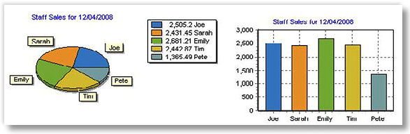
Humans are not very good at comparing angles, but can easily determine length and height. For this reason, pie charts are somewhat limited in their effectiveness when compared with other types of charts for many purposes. What makes matters worse is that the above pie chart is tilted, distorting the angles.