- Contents
- Index
- Search

Show results that include all search words
TeeChart
Reports > Clarity Report Designer
TeeChart is simply the name of the 3rd Party component that is used in MYOB EXO Business to give extensive charting capabilities. A TeeChart is added to your report in the same way as any other object, by selecting the icon in the toolbar.
Note: There are two buttons you can use with slightly different properties, just as there are for many other tool types.

The first TeeChart button is the regular Chart tool. The second button is the DBChart tool, or the data-bound chart tool. The DBChart tool is identical to the Chart tool in functionality and features except that it can take fields in a data pipeline as a source for the data on the chart.
Both kinds of chart can show static data, either hard-coded when the report is designed (not very useful), or added by code at runtime, from any source (data pipeline, parameters, calculations or otherwise).
Creating a new chart
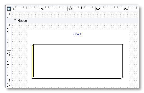
Select the Chart tool and add a chart to a new report canvas. When you create a chart, it won't have any data in it:
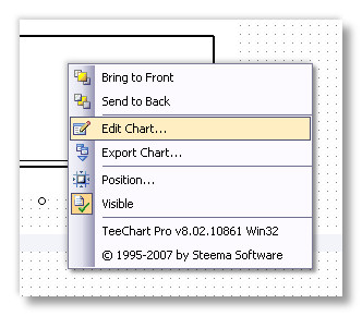
Right click on the chart and select "Edit Chart":
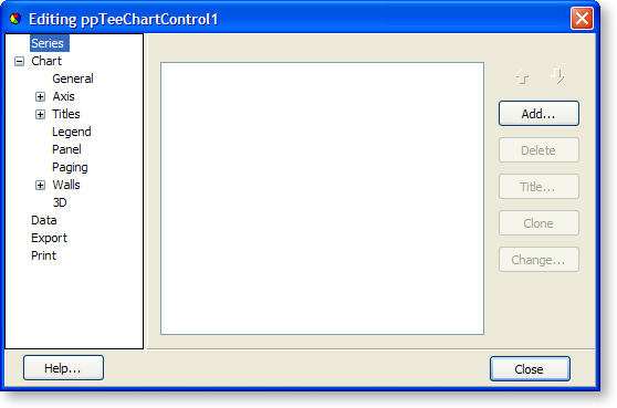
At this stage, don't be too daunted by the number of options, we're just going to look at some of the Series options. Ensure that "Series" is selected on the left and click Add on the right:
Select the chart type from the list and Click OK:
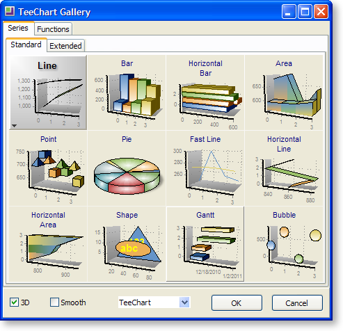
You've just added a data series to your chart. You can add as many series as you like. A series is similar to a data series in Microsoft Excel or other programs, and allows you to show data from different sources overlaid on top of each other. While each series can potentially be a different type of chart, this is rarely useful. One use, however, is to superimpose a line chart and a bar chart.
Now that you have added a series, you can add some data to it. Select the new series (it should be called "Series1" or similar) from under "Series" on the property tree on the left, then select the Data Source tab:
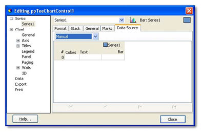
Under Data Source you have the option of several sources of data. These are as follows:
Manual
This allows you to enter your own data in the grid below. Simply click the cell and type the data you want, and press the Insert key on your keyboard to insert a new data row.
Random
For demonstration purposes, you can quickly add a number of randomly assigned data points. Select the Random option, choose the number of data points you want, then click the Apply button. You can either close the window to see the new chart or select "Manual" from the dropdown list again to see the list of values that were generated for you.
Series & Function
These are not currently used.
Data Pipeline (only available with a DBChart component)
This allows you to specify which properties of the chart take their data from fields in a data pipeline. This will be explained later.
Once you have selected your series data, you're ready to view the new chart – simply close the window and your new chart will display (charts that are linked to a data pipeline will need to be previewed in Clarity before the data will show in the designer).